
Tableau was designed as a tool for composing visualizations—"vizzes" in Tableauese—of data quantities. These visualizations (and I'll use 'viz' and 'vizzes' hereafter) are central to Tableau's value proposition in that they are enormously effective in helping people see and understand the quantities of their various data elements, and in the relationships between the quantities of multiple dimensions in different contexts. This is a very, very good thing, and Tableau supports the creation of these vizzes extremely well. There's a wealth of quantitative vizzes available for viewing at Tableau's Visual Gallery, Tableau Public Viz of the Day, and at many other places.
But there's a problem lurking in the background, a conceptual blind spot limiting Tableau's potential.
The prevailing paradigm is that vizzes are only vizzes when they're conveying quantitative information, when they're presenting numbers coded into a visual form. In the Tableau world measures are first class data citizens with status and prestige, deserving of special treatment, and dimensions are second class citizens whose proper role is to support the measures in their role of communicating the valuable information and insights they have to offer.
This post argues that this perspective is narrow and shortsighted, that it ignores, if it doesn't actually reject, the concept of data that considers dimensions as first class data elements with value to contribute. In fact, dimensions are valuable in the absence of measures, while measures without the context that dimensions provide have limited value. This can be a big pill for many people to swallow, particularly those whose experience has been shaped and is bounded by the more limited horizons; for them, numbers -are- data.
As examples, here are some presentations of quantitative visualizations of 2012 worldwide GDP (in millions of $US) measures from The World Bank's Open Data Catalog:
This visualization shows the value of GDP for a particular data set.

Clearly, the addition of the dimensional data adds real value.
But what about this post's title? Is it possible that a viz without -any- measures, without -any- quantitative data be valuable?
Yes. The following situation came up with one of my clients, a multinational organization with multiple regions, each charged with achieving some set of the organization's strategic goals. Each region was responsible for achieving its own results, each tied to the strategic goals, and specified by the organization's overall policies. The Tableau Public published dashboards below show what happened when we first used Tableau to examine the organization's data, which was sourced from an in-house custom-build budgeting and management system that only the technical person who build it understood.
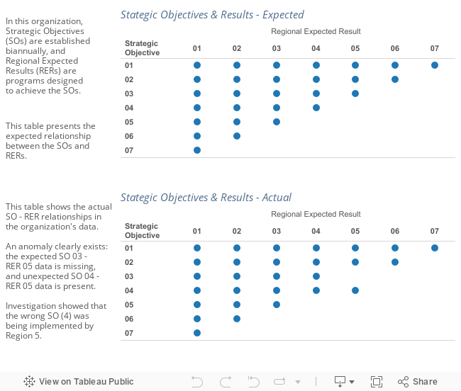
In this situation the simple cross-relating of SOs and RERs instantly showed an occurrence where the Strategic Object 4 program activity for Region 5 was erroneously being implemented instead of the correct SO 3 program, alerting senior management to the situation and providing them with the opportunity to identify the failure to follow policy.
So what? Is this really a big deal?
It is. There are multiple dimensions along which the framing of what data is shapes the analytical approach to exploring, analyzing, comprehending, and communicating our understanding of it. Tableau, as good as it is, has blind spots that are baked into it as consequences of its initial design paradigm, and as long as that paradigm holds the blind spots will exist, and opportunities to improve Tableau as a highly effective data analytical tool will be lost.
With those data sources, what would you like to see for a result?
ReplyDeleteWhat are the blind spots?
What do you think Tableau's design paradigm is?
Q #1 - with these data sets, I see exactly what I'm looking for.
DeleteQ #2 - this is like asking me "What are the prime numbers?" or "What are the colors between red and violet?" or "Where is the boundary of a Mandelbrot set?"
This blog is devoted to the identification of Tableau's blind spots, and one of my challenges is that they're fractal in nature, the small scale problems are consequences of the fundamental flaws, for example the artificial classification of data into a privileged class-numbers, and an unpriviledged class-dimensions, with dates in yet another class.
Q #3 - is another fractal question. I think there's a fairly solid design paradigm at Tableau's core, one that originally manifested in it's functionality, what I've some to think of as Tableau's sweet spot. I've never seen it documented or described, though. Not really. The closest I've seen are the early papers describing the concepts behind a visual query language, aka VizQL, and your work describing how VizQL really works. The former aren't really design oriented and your explanations are reconstituted analyses of the as-is state of things, not of the intentional design.
Contemplating Tableau's design gets very complicated very quickly. The more I dig into it the more I'm convinced that although there was a pretty good, coherent design at the start much if not most of the functionality that's been added since then has been cobbled on without a guiding design, which explains why common functionality is implemented in different ways in different parts of the product. It's very hard to believe that there's a decent design in Tableau's formatting functionality except the technical use of property sheets, however mangled that makes things from a usability perspective.
Another example where evidence of real design is lacking is in quick filter configuration: it should not be necessary to repeatedly trigger the "menu | Customize | toggle option" action to individually configure a quick filter's elements, nor should the first worksheet added to a dashboard have its quick filters also added while subsequent worksheets don't, or that a worksheet's quick filter configuration is ignored when the worksheet is added to a dashboard.
But I digress.
I find it impossible to discretely answer the question "What to you think Tableau's design paradigm is?" primarily because it's impossible to delineate a boundary that can close the question. Add to this the difficulty of trying to see patterns in turbulence, which is what it's like trying to enumerate and find commonality in all the different ways Tableau does things, and it's a job without end.
Q1 - If you got what you are looking for, what is the issue you are having that prompted this post? Maybe another route, like a data blend, may offer a way for the visualization to highlight the missing/incorrect data, like http://public.tableausoftware.com/views/ValuableMeasurelessVizzes-Highlight/HighlightDifference
DeleteQ2 - Yes, I agree that are many inconsistencies and things that happen in Tableau with nearly no documentation, but I am not asking a general question. I should have been more clear in my question, let me try again. You said "But there's a problem lurking in the background, a conceptual blind spot limiting Tableau's potential." Specifically, what is the blind spot(s) that you are referring to here, what is the specific blind spot(s) that is impacting this situation?
Q3 - For me, Tableau's design paradigm is a kind of grammar for graphics, a tool for thinking with data data in a unique way, one that enables a cycle of visual analysis. Tableau does this with their 4 pill types. On the whole, Tableau is only limited by the data contents and structure you connect it to. I agree with you, there are many user interface elements that leave room for improvement, like how quick filters are configured. I agree, when using Tableau sometimes it feels like their developers added some features without integrating them with the rest of the way Tableau and VizQL works, eg Forecasting. When this is combined with a lack of documentation and lack of explanation of how to think with Tableau, the experience of Tableau can be frustrating.
Just like any software, Tableau is not perfect, but Tableau does enable me to have a conversation with my data unlike any other application, and that benefit enables me to deal with and workaround the inconsistencies and missing features by creating my own mental model of the software because of the lack of documentation.
Data sets with few or no measures are not that uncommon (survey data, etc.). I use the Number of Records a lot in those cases to compare categories and sub-categories, slice different ways, etc. You do need something numerical, and if it's only the number of records, if you want to show anything at all. At the minimum, you're showing that there is data in any particular combination of categories, i.e., 0 or more than 0.
ReplyDeleteAlso, as Joe says: what do you want to see, or what do you want to be able to do?
I'm perfectly happy with the "Strategic Objectives & Results..." vizzes in the post. They show exactly what I needed to see: which combinations of dimensions contained data and which didn't.
ReplyDeleteMy point is that these are real data visualizations even though they contain no numerical information, only the existence or non-existence of data for each intersection. Which is somewhat at odds with the implicit paradigm that the analytics that contain visualizations of quantitative data are somehow more real or legitimate than those that don't.
Robert's statement: "You do need something numerical, and if it's only the number of records, if you want to show anything at all." is an example of this thinking, and it's exactly that thinking that I'm pointing out as limited and inhibiting.
Examples of unfortunate consequences of the numbers and higher-order data than non-numbers framing are the inability to configure dimensional tooltips and Tableau's inability to create visualizations with dimensions and measures intermixed. Joe and I have discussed the latter - he doesn't think it's needed and I think it's a legitimate way to organize data, one that any truly capable data analysis system should support.