It's a very good day when a new book on some aspect of data analysis shows up. It's very, very good when two show up on the same day, a recent occurrence that brought "Information Dashboard Design – Second Edition" and "Rapid Graphs with Tableau 8 – The Original Guide for the Accidental Analyst".
I have multiple copies of the original "Information Dashboard Design" book, and have given more copies to colleagues. It's been one of my go-to sources for good solid professional advice on how to design and deliver high quality dashboards that communicate clearly, effectively, and well.
I also have a copy of "The Accidental Analyst".
This is my initial take on both of the new books after a quick perusal.
Information Dashboard Design Second Edition
Buy it.
Read it.
Read it again.
Learn what Mr. Few has to say and you'll be well equipped to deliver on the promise every professional makes: to produce high quality work that your clients will be happy to receive, that deliver value and stand the test of time.
Rapid Graphs with Tableau 8 The Original Guide for the Accidental Analyst
If you're interested in learning how to use Tableau to explore and analyze your data, and to communicate the interesting and valuable insights and information you glean from it, buy a different book.
Take Tableau's free online training.
Use Tableau.
Find someone who knows and uses Tableau and sit with them while they do.
Join your local Tableau User Group or Tableau Meetup group.
I'm not really sure how to address what I found about this book that I find disappointing, so I'll just offer a few observations.
The production values are low–it's in black and white, and for a book on data visualization that makes much of the use of color that's almost a nonstarter on its own. The layout is poor, with text crammed to the edges of the pages but also with large blank spaces where useful content could be. The image quality isn't good; aside from the lack of color there's a general lack of crispness. Where holding Few's book is an invitation to explore, peruse and study this book is almost cavalierly unconcerned with drawing you in.
The organizational scheme is skewed. Detailed operational topics are expounded on before the basic data analytical activities someone new to Tableau (even only relatively) needs to know how to do. Treemaps are in Chapter 4 - "Core view types in Tableau" while Scatterplots are in Chapter 5 - "Advanced view types in Tableau", along with maps.
But worst of all, it feels like a warmed-over standard software training manual, with a little higher-level advice added. It uses the traditional software operational training model: here's how to do X with the tool and here's the Y result you get. This "show a picture of the tool, write some paragraphs about what you do here" style isn't a good model for helping build competence and confidence, but it's been around since the dawn of manuals and it looks like it's not going quietly any time soon.
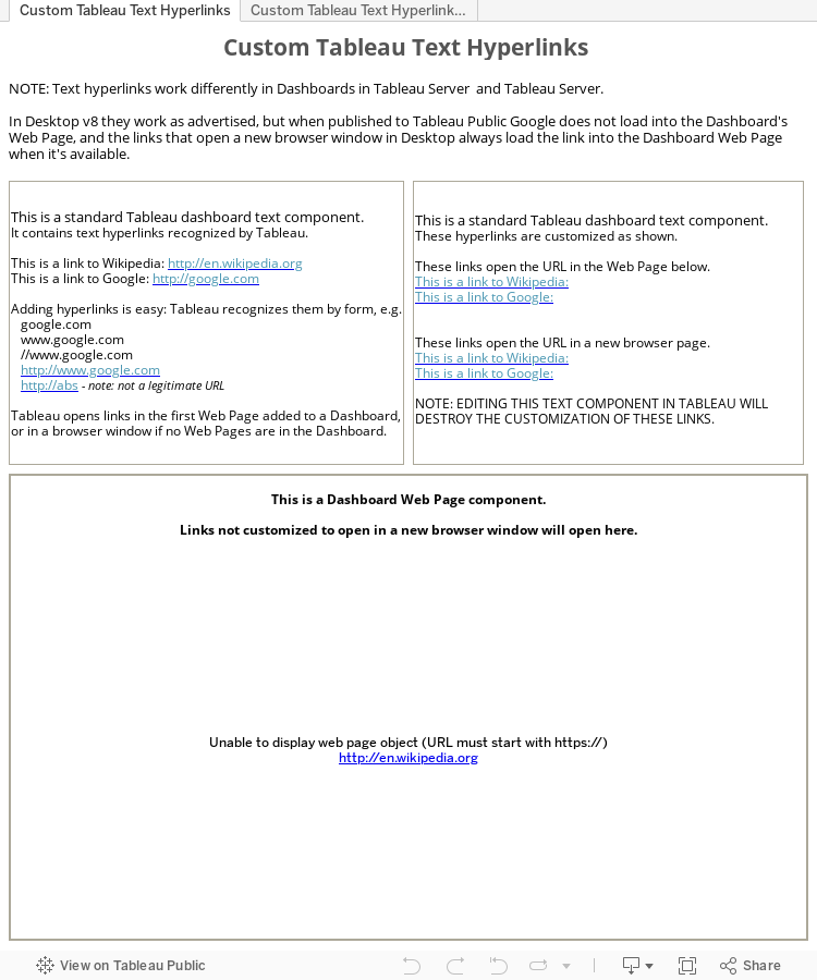
One of Tableau's very nice but little known features is the ability to put hyperlinks in Dashboard text components simply by adding the URL so that they work just like a standard web hyperlink, e.g.
http://en.wikipedia.org. As implemented the links work by opening the URL into the first Web Page component added to the Dashboard, or into a new browser window or tab if no Web Pages are present.
This is a terrific feature because it allows one to put links into Dashboards without involving the heavy machinery required to use data in worksheets coupled with URL actions. In those circumstances where a straightforward simple link is all that's needed using worksheets and actions has always been massive overkill.
While nice, and very much appreciated, the current text URL links leave some things to be desired, so I'm presenting here a way to customize them with two additional features:
providing alternate text for the link instead of the naked URL; and
explicitly have the link open a new browser window or tab for accessing the URL.
This Tableau Public Workbook shows the basics of adding Text hyperlinks to your Dashboards. As advertised, it's dead simple: you only need to enter the URL into your Text component and Tableau will recognize it. Pasting a copied URL is usually preferred to typing it it.
It also shows some examples of the normal Text links customized to have an alternate name, and to explicitly open the URL in a new browser window or tab whether or not the Dashboard contains a Web Page.
How to customize your links. Now that you can enter text links, how do you customize them?
NOTE: this customization requires hacking your Workbook.
It's not available in Tableau, is unsupported by Tableau (at least I haven't asked them about it), and requires editing the Tableau Workbook directly. So if you choose to try it, make sure you are using a copy of the Workbook(s) you want to customize because you just might corrupt them and render them useless.
Option 1 – hand edit your Workbooks.
Don't do this.
It's a bad idea.
Chances are very good you will corrupt your Workbook and render it unusable.
But if you absolutely must give it a go, be careful and only work on a copy of your Workbook until you're completely sure that everything's OK.
The hand customization process is simple in principle:
open the Workbook in your favorite text editor (NOT Word or some other word processor, and please don't let me hear about your troubles with Notepad – I've been using Textpad for years and highly recommend it);
find the section in it with the text link you're interested in customizing; and
and customize away.
Adding a new label for the link is easy, it only takes providing the new label as if you were adding it to HTML, and I assume you're familiar with that, otherwise you might want to rethink hand editing. Adding the explicit directive to always open the link in a new browser window is a fair bit trickier, I highly recommend downloading the Tableau Public workbook and looking into it to see how it's done by comparing a link that will open in a Web page and one that always opens a new browser window.
Option 2 – use the Ruby script below.
Using the Ruby script has several advantages over hand editing:
it will not corrupt your Workbook–customized Workbooks are saved with the original name with ".CustomLinks" appended, i.e.:
"abc.twb" -> "abc.CustomLinks.twb";
it will customize all the Workbooks in the current directory, making it easy to customize a bunch of text links all at once;
it's easy to configure to identify the specific URL to customize with the new label and whether or not to force a new browser window.
Using the Ruby script has several dependencies:
it's a Ruby script so your machine must be able to run Ruby, and you must have permissions to do so (sometimes not so easy in a corporate environment);
it uses some non-standard Ruby gems (libraries) so these need to be installed on your system – this is usually very straightforward and a quick Google will show the way;
you really should be comfortable with this level of technical stuff – if you're not there's likely someone nearby who can help, or you can always contact me.
# TTC_CustomizeTextLinks.rb
# - this Ruby script Copyright 2013, Christopher Gerrard

require 'nokogiri'
require 'open-uri'
require 'CSV'

# These are the values used to configure the Text links
# -----------------------------------------------------
$url       = 'http://google.com'
$title     = 'A Link To Google (new window)'
$newWindow = true

def parseTWB twb
  puts "  - #{twb}"
  doc = Nokogiri::XML(open(twb))
  if handleURLs(doc) then
    writeTWB(doc, twb)
  end

end

$newWindowStr = 'target="_blank"'

def handleURLs doc
  customized = false
  # locate the Text links
  docNodes = doc.xpath("//formatted-text/run[@hyperlink]")
  docNodes.each do |node|
    link    = node.attribute('hyperlink')
    linkStr = link.to_s
    # if the Text link contains the URL to customize...
    if !linkStr.index($url).nil?
        node.content = $title
        if $newWindow && linkStr.index($newWindowStr).nil?
           link.content = linkStr + ' ' + $newWindowStr
        end
        customized = true
    end
  end
  return customized
end

def writeTWB(doc, twb)
  newTwb = File.open("#{twb.sub(/.twb$/,'')}.CustomLinks.twb",'w')
  newTwb.puts(doc)
  newTwb.close
end

puts "\n checking for #{$url} in:"
Dir.glob("*.twb") {|twb| parseTWB twb }
What TTC_CustomizeTextLinks.rb does.
Each of the Workbooks in the current directory is opened up and examined for the presence of the Texl links to be customized.
If any are found they are customized appropriately and a copy of the Workbook is made with the customized links.
No Workbooks are harmed during the customizing of the links.
The name of the new copy Workbook is the same as the name of the original Workbook with the trailing ".twb" replaced with ".CustomLinks.twb"
For example, the Workbook "abc.twb" is copied, links customized, to "abc.CustomLinks.twb"
How to use TTC_CustomizeTextLinks.rb
Prerequisites
Minimal technical skills.
Have Ruby installed and ready to run.
Have the Nokogiri Ruby gem installed—it's used in the XML parsing.
Have the open-uri Ruby gem installed.
Have TTC_CustomizeTextLinks.rb in place—it doesn't matter where, or what name you use, as long as you know where it is.
You can copy the code above and paste it into your favourite text editor.
Running TTC_CustomizeTextLinks.rb
Open a command prompt. (you can run it otherwise, but this is simple and straightforward)
CD to the directory containing the Workbooks you're interested in.
Run it: "[path to]\ruby [path to]\TTC_CustomizeTextLinks.rb"
Presto. You now have a set of your Workbooks with all of their identified links customized.
The usual caveats.
TTC_CustomizeTextLinks.rb works fine with the limited testing it's been through, but it's definitely not bulletproof and hardened.
It's only been run against Tableau v8 Workbooks, and it's entirely possible that other Tableau version Workbooks might not be properly edited, and it's possible that there are other conditions that might casue bad outcomes.
I hope it works for you, but make no guarantees.
If you do use it and make improvements I hope that you'll post them back here as comments so I can learn from them, and hopefully other people can benefit from them too.
This post was motivated by a discussion on the Tableau Ideas forum created by Johnathan Drummey concerning the desirability of being able to unhide Worksheets from the Dashboard Worksheet window. see it here
Hiding and unhiding Worksheets in Tableau is a pain. Tableau provides very little guidance in helping surface the information about which Worksheets are related to which Dashboards, and whether the Worksheets are visible or invisible. (the question of visibility gets pretty tricky since a Worksheet that's visible when a Workbook is closed may not be visible when it gets opened the next time)
Addressing this problem was one of the motivations for building TWIS, and it does a good job of teasing this information from your Workbooks and making it available as data so that you can see the individual Worksheets' visibility status, and it creates diagrams that show the linkages between Dashboards and the Dashboards they contain.
This is all nice and good, but the complexity of the relationship network between a Workbook's component parts is very hard to model in a way that makes it simply accessible with Tableau. Tableau simply isn't capable of handling rich data relationships (I know that miracles can be worked with custom SQL, but that's the type of technical expertise that Tableau's supposed to insulate us from).
Tableau really needs an integrated mechanism for presenting the Dashboards-Worksheets relationships that provides the opportunities to effectively surface and manage their salient characteristics. Tableau has made some strides in Tv8 with additional functionality, e.g. with the Dashboard component tree in the Dashboard window, but it's not a coherent approach, nor will it scale, nor is it applicable for the general case of modeling and managing all the different types of complex relationships inside Workbook. Solving this problem is essential for Tableau if it's going to take the next step forward, away from accessing simple flat data, into the modern post-SQL world.
With this in mind, I took the SVG diagram TWIS created for the Tableau sample Sales Workbook and modified it (not much) to see if I could get something that might be useful. The results are below. Just a sketch, it shows one way to represent a Workbook's Dashboards and Worksheets and manage the Worksheet's visibility. The model has these useful properties:
It clearly lays out the linkages between the Dashboards and Worksheets, making it easy to see:
All of the Dashboards, or a filtered subset of them.
All of the Worksheets, or a filtered subset of them.
The Worksheets each Dashboard contains.
The Dashboards each Worksheet appears in.
It provides a filter for selecting those Dashboards and Worksheets that contain the user-entered text in their name.
Ideally this would be the native behavior for search, as people expect from the Google model, and is increasingly found in modern analytical tools, but this might be too big a departure from Tableau's per-field filtering model.
Filtering also needs to be extended to handle sophisticated properties, e.g.: only those Dashboards that contain no, some, or a specific number of Worksheets; Dashboards that contain only those Worksheets that access certain data sources; Worksheets that appear in Dashboards with some identifiable properties; and so on, but I don't expect this soon. (I'm planning a post on this topic)
It provides a mechanism for configuring a set of selected Worksheets to be either visible—"Show", or hidden—Hide.
This assumes a multi-select operational mode wherein the User can select multiple Worksheets for configuration. This is standard object-action user interaction, which Tableau already employs, although not universally.
Another model would be direct controls on the Worksheets that could directly toggle their visibility on and off, reducing the click count – this function could exist in tandem with the multi-select configure-many model. This is the type of thing that real usability design and testing is needed for.
This model is only that—a model. In the real world there is a lot of additional polish that would be needed for it to work as well as it should, e.g. the ability to select multiple Worksheets directly; auto-selecting all the worksheets when a Dashboard is selected; using thumbnails effectively to support the visible identification of Dashboards and Worksheets, either inline, which has space considerations, or in tooltips, which imposes a temporal cognitive load; and so on.
It would be a very interesting exercise to see what it would be like as an mini-app that could actively manage a Workbook's Worksheets' visibility without the bells and whistles. The core functionality is already part of TWIS, and some of it's been published in my previous post: "Unhide that Worksheet!". The challenge would be building a good enough user interface, and I'm not likely to have the time to devote to it. But if anyone with the UI creating skills wants to collaborate on it, drop me a line.
Clarity and predictability are hallmarks of good design. An object that offers an affordance suggests that something can be done to it. Two objects that offer the same affordance suggest that each can be operated individually via its affordance.
For example, when you approach a pair of doors, each with a "pull open" handle it's normal to expect that pulling on the left door's handle will open the left door towards you, and that pulling on the right door's handle will open the right door towards you. It would be confusing if the right door handle operated both doors and the left door handle operated only the left door. It would be even worse if using the right door handle made the left door handle disappear. Imagine the confusion this would create in the mind of someone expecting normal behavior.
Could something this weird happen in Tableau land?
Yes. This post presents, for your consideration:
The Case of the Disappearing Axis.
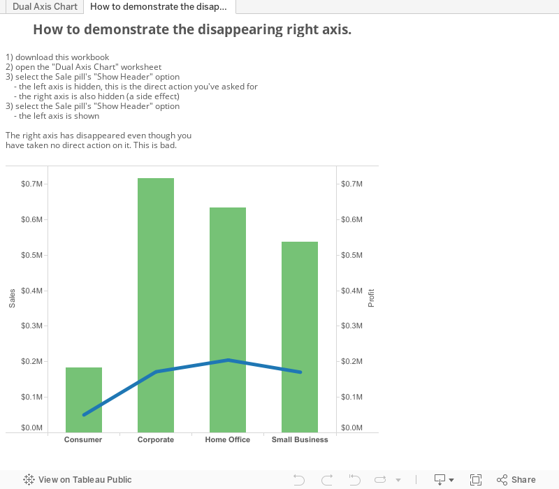
This is a typical Dual Axis chart.
The Sale axis is on the left,
the Profit axis is on the right.
Each axis' pill on the Rows shelf has a
"Show Header" option in its pull-down menu.
The "Show Header" option is a toggle, switching the
axis between being shown and hidden.
A reasonable expectation is that when one selects
the "Show Header" option for either Sales or Profit
the corresonding axis will be shown or hidden,
depending upon its current state.
This is not quite true in Tableau.
Here's an example of an unexpected outcome.
Starting with the Dual Axis Chart at left, follow these simple steps:
Step 1.
- select "Show Option from the Sales menu
- Tableau hides both axes
Step 2.
- select "Show Option from the Sales menu
- Tableau shows the Sales axis
What happened to the Profit axis?
It wasn't touched and yet it's disappeared. This is bad.
Step 1.
You select the Sales "Show Header" option expectation: Tableau will hide (unshow) the Sales axis
Tableau hides both axes.
Step 2.
You select the Sales "Show Header" option expectation: Tableau will reverse the previous action, i.e. will Show both axes since it previously hid both of them
Tableau shows the Sales axis.
What? Something's not right here, but what?
Confused?
Not sure –what– went wrong, although it really feels like something did?
There are actually two problems occurring at the same time, each of which is a problem, but when encountered in combination they create a confusion, a sense of disorientation in the mind of the person encountering them.
First Problem: non-local action.
The Sales' "Show Header" option is presented in a context that strongly associates it with, and only with, the Sales field, and by extension to the Sale axis.
However, when Sales' "Show Header" is selected to hide the Sales axis, it also hides Profit's axis. This action violates the sphere of influence that is implicit in the direct connection between Sales and its "Show Header" option.
This isn't good, but isn't all that bad in this scenario. Since the user has just taken a single action, and that action appears to be a toggle that switches states, it's only reasonable to think that throwing the switch in the other direction will reverse the situation and restore the system to its original state. Just like flipping a light switch turns it on and off. So the user toggles Sales' "Show Header" option again expecting to see both axes restored to visibility.
But that's not what happens.
Instead of both axes being shown, only Sales' is.
Second Problem: Operational Asymmetry.
In the context of this scenario, the Sales "Show Header" action works differently depending upon whether it's being used to show or hide:
Hide
– when used to switch from show to hide, both axes are hidden
Show
– when used to switch from hide to show, only the Sales axs is shown
As bad as non-local action is, it wouldn't be so harmful if the functionality of Sales "Show Header" option was symmetrical. If it showed or hid both axes at the same time it would be less flexible but also much less confusing.
And as bad it this scenario is, it's only part of the whole story. Stay tuned for the next chapter in the thrilling adventures of Dual Axis Chart Axis Visibility Management.
Dual axis charts are good choices for presenting two measures in a common context so they can be compared.
The dual axis charts immediately below are duplicates of Tableau dual axis chart. The one on the left is as-is, the one on the right identifies the left and right axes.
Note: everything in this post is applicable to
dual axis charts with the dual axes on top and bottom,
with left mapping to top and right to bottom.
This chart has both the left and right axes visible.
This is normally the desired presentation, but there are circumstances wherein it's desirable to have one one or both of the axes hidden.
This post lays out the different presentations Tableau makes possible, and how to achieve them.
Unfortunately, there are two big problems one runs into:
Tableau treats the left and right axes differently, which prohibits a perfectly legitimate presentation from being possible; and
the mechanisms for hiding and showing the axes are worse than unintuitive: they're actively perplexing, causing confusion instead of clarity in the mind of he user trying to configure their chart's axes.
The different possibilties for showing and not showing (hiding) axes.
Interestingly, Tableau does not use "hide" or "hiding" for the condition where an axis is not being shown, reducing it to a negative state which relies upon a double interpretation, which is a significant cognitive barrier that imposes a real and unnecessary burden upon the Tableau user. I will use "hide" and "hiding" for the not-shown state; even though doing so adds an additional interpretive layer to this discussion if Tableau corrects the situation it will cease to be a problem.
There are four different possible states for showing or not showing the left and right axes:
Both showing;
Left only showing;
Right only showing;
Neither showing.
There are alternate ways to describe these states, e.g.
"Left showing, Right not showing".
I prefer the language as presented because it's clear, concise, and specific.
Here are Tableau's implementations of the four states:
What? No right axis only showing? Sad but true.
Why? No Design? Bad design?
I have no earthly idea why Tableau doesn't allow the right axis to be visible when the left one isn't. It feels like it's one of those situations where functionality was implemented ad-hoc to support a new feature, in this case the second—right—axis. In this sort of situation the impulse and/or time (or other) pressure to put in a new feature occurs without a systemic contemplation of higher-level consideration along with a coherent design in place and used to guide the product evolution.
Of course, I could be wrong and whomever was responsible for this part of Tableau made a conscious decision to do things this way. In which case they made the wrong decision, if for no other reason than it makes little to no human sense for the left axis' visibility to be dependent upon the right axis' visible state, added to which the mechanisms for showing and hiding the axes are needlessly complicated and confusing, which I assume is a consequence of the cross-linked super/subordinate relationship between the right and left axes.
Show and Hide Axes in Tableau(only they're called "Header" not "Axis")
In another case of confusing nomenclature, when presenting the opportunity to show or hide an axis Tableau uses "Show Header" instead of "Show Axis". This is particularly confusing since there's also an "Edit Axis" mechanism shown in the axis' right-click menu that allows you to, well, edit the axis. Why Tableau thinks that when showing and hiding an axis it should be called a Header is a mystery.
To be fair, I think I see a reason why it –might– make sense to call an axis a header. It's related to the distinction Tableau makes between Axes and Headers, which are the representations of the organizing elements for the worksheet's Cartesian space. Tableau makes a real distinction between continuous and discrete elements in this context, using them differently to organize the space. There's a lot of merit in this scheme but taken too far it bleeds over into other areas with ill effect – but that's whole topic unto itself and will have to wait its turn.
"Show Header"
Tableau's "Show Header" mechanism is a toggle that alternately shows and hides the axis it's attached to. (except when an axis' "Show Header" option operates on both axes, which is a weird and confusing affair, more on which later)
"Show Header" shows up in two places: on the axis' measure's pill on the Rows shelf; and on the axis' right-click menu, which is only available when the axis is visible.
Showing and Hiding axes has two steps.
Find the "Show Header" option
for the axis you want to show or hide
(there are wrinkles to this that I'll point out in a bit)
Toggle the "Show Header" option
The "Show Header" option has two states: checked and unchecked. When checked, the axis is visible, when unchecked, the axis is not visible.
As the diagrams below show, sometimes toggling "Show Header" switches only that axis visible state and sometimes it switches both of them.
Seems simple enough.
Not so fast. Here's where things get complicated. What happens when you toggle "Show Header" depends upon whether it's the left or right axis, and which axes are visible.
Keeping track of which does what when is difficult. It's so difficult, in fact, that it's simpler and easier to just try something and see what happens. If it's what you want then all's fine and good; if not then try something else.
This is very poor design, and is an active impediment to usability. Instead of having a rational and reasonable human-oriented model of independent axes with similarly independent visibility states Tableau links them together so that achieving simple straightforward tasks is more difficult than it should be, makes showing only the right axis impossible.
Must it be this bad? Is there hope for improvement?
I hope that things will get better. It's hard to believe that there's an insurmountable fundamental technical reason why the current axis model can't be replaced with one that works the way real human people need and expect. Whether Tableau fixes it or not is another question, one that goes into the big bucket of questions about whether the product will improve as it evolves. Time will tell.


