
Take 1 – a first look at improving bar chart cogntion with white space as a design element
This post is an initial exploration into using white space to enhance the readability of a standard horizontal bar chart by increasing the distance between related bar groups. The basic idea is that in these 3-level horizontal bar charts there are similarly 3 levels of associative relationships that aren't being well conveyed in Tableau's current layout. I believe that this experiment shows that adding a modicum of white space to the charts provides real cognitive benefits in organizing the content in line with its sorting structure.
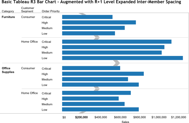
A typical Tableau Bar Chart

This chart is a simple image saved from a Tableau worksheet.
Although it's easy to compare the relative bar sizes a a whole there's very little in the way of visual cues helping to determine the distribution of quantities vis-a-vis the groupings created by the sorting of the organizing dimensions.
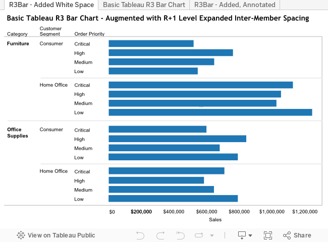
Improved Bar Chart – White Space Delineates Sort Groupings

This chart was created in Inkscape using the Tableau chart as a model and saved as an image.
White space was added to increase the separation of each of the dimension's bar groups.
This additional white space provides precognitive visual orientation of the chart's dimensional groupings, which in turn makes it much easier to interpret the quantitative relationships withing and across the groupings.
Improved Bar Chart – White Space Design Enhancements Identified
This copy of the enhanced chart has blazes denoting the location of the added white space (also Inkscape, also an image).
Adding the augmenting white space has a couple of subtleties.
The amount of white space is proportional to the 'level' of the cross-dimensional gap between bar groupings—in this case the gap between the bars is related (roughly) thus:
Order Priority | Customer Segment | Category => 1 | 2 | 3
The chart's outer bars are separated from the chart's borders by white space equal to one-half the white space between the Customer Segment groups.
Published to Tableau Server
This workbook contains the original R3B chart as well as the enhanced white space images shown above.
The R3B Charts as SVG – Scalar Vector Graphics
SVG has been around for quite a while and is finally coming into its own as a bona fide standard for Web vector graphics. I've been using Inkscape for some years to create SVG diagrams, including the following renderings of the R3B charts. The initial chart is a straightforward overlay of the original Tableau chart, the others are copies of it with the white space enhancements added. Once an SVG model is created it's straightforward to adjust it to suit one's design goals.
One of SVG's huge advantages is its scalability without loss of resolution. You can zoom in or out to whatever degree you like and the SVG images will be as sharp as your browser is capable of rendering. There's none of the magnification fuzziness that you get when magnifying non-vector images. Try it yourself—zoom this page in and out and compare the SVG images with the PNG images above.
One small note—since this SVG was created in Inkscape it contains a fair bit of content that isn't strictly required. So it's a fair bit larger than it needs to be, but that's a consequence of using a tool over hand-crafting.
SVG is increasingly used as the graphics delivery vehicle for a number of emerging data visualization tools and technologies, including d3.js - Data Driven Documents. These are increasingly sophisticated environments for rendering data visualizations with very robust and fine control over all aspects of the presentation. If time permits, I hope to be able to build a framework where one can experiment with the various white space parameters for these R3B charts and watch them dynamically adjust in response.
What else?
This work is only a small part of what can and should be done to develop a comprehensive, coherent design philosophy for the types of data analytics that Tableau provides. Here are some of the topics I hope to cover in the not too distant future:
-
Developing a nomenclature for the different charts and their elements.
VizQL may be a wonderful visual language for laying out the analytical elements in the Tableau UI that create analytics, but there's no 'real' language that can be used to communicate this same information. (Any linguists out there who can help with the correct term for spoken and written languages?)
I've been referring to the charts in this post as R3B, but suspect it doesn't mean anything to anyone other than me; it identifies a Bar chart with 3 dimensions in the Rows columns. -
Developing a good model for denoting the other decorative/structural elements of the Tableau data analytical space.
For eample, there is no visible model for many of the framing elements, including a frame for the entire analytic (which has dire consequences in dashboards when one needs to artificially create a container for a worksheet in order to put a border around it. - Coming up with a good model for a dashboard layout manager. Tableau has made good progress in the dashboard layout manager through the releases but it's still coarse, difficult to manage and missing many elements found in modern UI building tools.
- There's more, but I do need to get this post finished and published.