
Great
The ability to connect a quick filter on a Dashboard to any, or all, of the Dashboard's Worksheets is a huge big deal.
Not being able to do exactly this has been one of Tableau's most glaring design gaps for a long time. The lack of this functionality has led to all sorts of workarounds and tricks, all of which have had to their own problems, direct and indirect.
Flawed
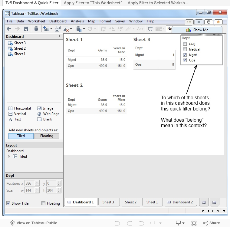
The big fly in the ointment is that although it's really handy to know from which Worksheet an given quick filter came from, this valuable piece of information isn't put front and center. In order to find it, one has to navigate three levels down into the quick filter's context menu. This isn't a bad place for this information to be presented, but it's really ungood that one needs to dig down there to find it.
Principle Violation
Not providing relevant, valuable information in the primary context, where it's available without the User needing to dig around for it.
Tableau's value is in it's ability to provide easy, transparent access to the information in business data. It should take and zealously enforce the same guiding principle with its own information; in this case it doesn't.
This Tableau Public published workbook's dashboards demonstrate the situation.
Hi Chris,
ReplyDeleteThis has been a point of debate at Tableau for a while. Back in v6.1 we did in fact identify which filters where associated with which worksheets in a dashboard. You can see an example of this in the following screenshot of a dashboard, which shows dashed lines surrounding the top-most two quick filters to the right of the selected sheet: http://eden.rutgers.edu/~renee3w/554/tableauexercise/tableaupics/class%20size%20dash.png
The shortcoming to this approach is that it draws unwanted attention to particular sheets or filters as a user interacts with a dashboard in Tableau Desktop or via a browser. Many times the context for the filters is clearly expressed by thoughtful dashboard layout, descriptive titles and textual instructions describing how the audience can interact to answer their own questions. We found that the additional context hints Tableau provided was distracting from the overall story, and we removed that functionality in v7.0.
Perhaps we can consider restoring some similar functionality for authors but not their audience.
-Robert
Hi Robert,
ReplyDeleteSeeing the v6.1 image was like seeing an old friend.
It does bring up a number of things, as does your comment, surrounding the visual prominence of elements in design and consumption modes. I've long wished that the frame enhancing for the last-touched element could be turned off, feel like it's almost always a cognitive distraction for someone who's simply using the dashboard to see data.
If Tableau's going to open the door to having distinct authoring and consuming modes that makes many, many possible authoring improvements possible that would simply overwhelm the consumer's visual space.
I've heard from multiple people at Tableau that there's a commitment to "no modes". Perhaps it's getting to the point where the operational complexity of handling Tableau's increasingly rich functionality makes modal use a compelling option.
And the modal barrier has already been breached, albeit in not too obvious ways.