
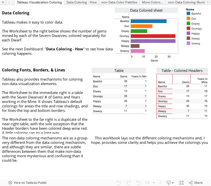
Tableau introduced the effective use of color as a strategic element in data visualization. By promoting data coloring to a top-level concern, and implementing highly effective data coloring as the default, Tableau blazed a trail leading out of the garish wilderness populated by ill-considered and wildly discordant colorings that did little but, well, be colorful.
It's odd, then, that Tableau makes it extremely difficult to apply the same coloring to non-data elements as it does to the data. Coloring fonts, borders, and lines can be very frustrating. Harmonizing the color schemes for data and non-data viz elements is much more difficult and frustrating yet.
There are several main reasons for the difficulty in coloring non-data elements:
- Tableau uses at least three different UI controls for presenting the initial color palettes, this is because coloring is only a subset of formatting, and the controls include not only the color palettes, but the other formattable aspects of the viz element-see the "non-Data Color Palettes" in the Workbook to see the different controls. Having similar but different controls for a common function is confusing and imposes a cognitive burden upon the user to recognize and remember not only that there are different controls, but that there are different palettes in use. On top of this, it's very difficult to keep straight what is configurable for a given element since this can only be inferred by the content of the format control.
- There are two different and incompatible palettes used: a pastel palette for shading areas; and a dark palette for fonts and lines (lines include borders) — further, neither of these palettes is compatible with the data coloring palettes. All in all, matching colors for the different visual elements in a single viz is difficult, multiply so for an entire Workbook;
- Associating the viz elements with their components in the format property sheets is not obvious. Although not strictly related to coloring, this compounds the problem by making it very difficult to determine which element to color in order to achieve the desired effect.
The Tableau Public-published Workbook below illustrates the major components of visualization coloring. I hope that it helps clear up some of the mystery, that it helps you achieve the effects you want, and to hear from anyone who finds it useful or has suggestions for improvement.
Chris - This is outstanding. I love this for a couple different reasons:
ReplyDelete1. You really took the time to explore and pull out some key parts of the Tableau Desktop UI when it comes to using color.
2. You used Tableau as the presentation medium! We do this all the time internally to the point where you rarely see PowerPoint slides anymore.
Hi Chris,
ReplyDeleteThanks for putting this together! The one thing I was kind of hoping for when I saw this post was to take the Tableau dark & pastel color pickers and use a dropper tool from some app get the RGB values to turn those into custom color palettes, and conversely get the RGB values of the default color palette and publish those so users can (manually) enter them in as custom colors for borders, etc.
If you're interested, maybe we could split up the workload?
Jonathan
Thanks for the nice blog. It was very useful for me. I'm happy I found this blog. Thank you for sharing with us,I too always learn something new from your post.
ReplyDeleteTableau Consultant