Thursday, July 25, 2013

Enhanced Chart Design - Adding White Space to Bar Charts

Take 1 – a first look at improving bar chart cogntion with white space as a design element

This post is an initial exploration into using white space to enhance the readability of a standard horizontal bar chart by increasing the distance between related bar groups. The basic idea is that in these 3-level horizontal bar charts there are similarly 3 levels of associative relationships that aren't being well conveyed in Tableau's current layout. I believe that this experiment shows that adding a modicum of white space to the charts provides real cognitive benefits in organizing the content in line with its sorting structure.

A typical Tableau Bar Chart

This chart is a simple image saved from a Tableau worksheet.

Although it's easy to compare the relative bar sizes a a whole there's very little in the way of visual cues helping to determine the distribution of quantities vis-a-vis the groupings created by the sorting of the organizing dimensions.

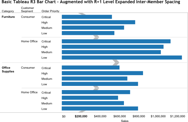
Improved Bar Chart – White Space Delineates Sort Groupings

This chart was created in Inkscape using the Tableau chart as a model and saved as an image.

White space was added to increase the separation of each of the dimension's bar groups.

This additional white space provides precognitive visual orientation of the chart's dimensional groupings, which in turn makes it much easier to interpret the quantitative relationships withing and across the groupings.

Improved Bar Chart – White Space Design Enhancements Identified

This copy of the enhanced chart has blazes denoting the location of the added white space (also Inkscape, also an image).

Adding the augmenting white space has a couple of subtleties.

The amount of white space is proportional to the 'level' of the cross-dimensional gap between bar groupings—in this case the gap between the bars is related (roughly) thus:

Order Priority | Customer Segment | Category => 1 | 2 | 3

The chart's outer bars are separated from the chart's borders by white space equal to one-half the white space between the Customer Segment groups.

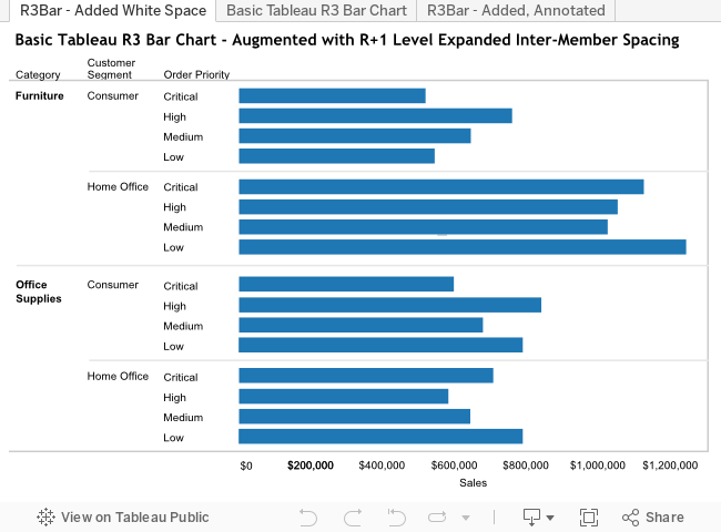
Published to Tableau Server

This workbook contains the original R3B chart as well as the enhanced white space images shown above.

The live Tableau chart isn't identical to the image of it due to the worksheet-resizing behavior of Tableau dashboards, which is another area in need of a rethink and design rationalization, but that will have to wait.

The R3B Charts as SVG – Scalar Vector Graphics

SVG has been around for quite a while and is finally coming into its own as a bona fide standard for Web vector graphics. I've been using Inkscape for some years to create SVG diagrams, including the following renderings of the R3B charts. The initial chart is a straightforward overlay of the original Tableau chart, the others are copies of it with the white space enhancements added. Once an SVG model is created it's straightforward to adjust it to suit one's design goals.

One of SVG's huge advantages is its scalability without loss of resolution. You can zoom in or out to whatever degree you like and the SVG images will be as sharp as your browser is capable of rendering. There's none of the magnification fuzziness that you get when magnifying non-vector images. Try it yourself—zoom this page in and out and compare the SVG images with the PNG images above.

One small note—since this SVG was created in Inkscape it contains a fair bit of content that isn't strictly required. So it's a fair bit larger than it needs to be, but that's a consequence of using a tool over hand-crafting.

image/svg+xml Category Customer Segment Order Priority $0 $50,000 $100,000 $150,000 $200,000 $250,000 $300,000 Sales Furniture Consumer Critical High Medium Low Home Office Critical High Medium Low Office Supplies Consumer Critical High Medium Low Home Office Critical High Medium Low Basic Tableau R3 Bar Chart image/svg+xml Basic Tableau R3 Bar Chart - Augmented with R+1 Level Expanded Inter-Member Spacing Customer Segment Order Priority Category Consumer Home Office Critical High Medium Low Critical High Medium Low Furniture Consumer Critical High Medium Low OfficeSupplies Home Office Critical High Medium Low Sales $0 $200,000 $200,000 $400,000 $600,000 $800,000 $1,000,000 $1,200,000 image/svg+xml Basic Tableau R3 Bar Chart - R+1 Level Expanded Inter-Member Spacing - Annotated Customer Segment Order Priority Category Consumer Home Office Critical High Medium Low Critical High Medium Low Furniture Consumer Critical High Medium Low OfficeSupplies Home Office Critical High Medium Low Sales $0 $200,000 $200,000 $400,000 $600,000 $800,000 $1,000,000 $1,200,000

SVG is increasingly used as the graphics delivery vehicle for a number of emerging data visualization tools and technologies, including d3.js - Data Driven Documents. These are increasingly sophisticated environments for rendering data visualizations with very robust and fine control over all aspects of the presentation. If time permits, I hope to be able to build a framework where one can experiment with the various white space parameters for these R3B charts and watch them dynamically adjust in response.

What else?

This work is only a small part of what can and should be done to develop a comprehensive, coherent design philosophy for the types of data analytics that Tableau provides. Here are some of the topics I hope to cover in the not too distant future:

  • Developing a nomenclature for the different charts and their elements.
    VizQL may be a wonderful visual language for laying out the analytical elements in the Tableau UI that create analytics, but there's no 'real' language that can be used to communicate this same information. (Any linguists out there who can help with the correct term for spoken and written languages?)
    I've been referring to the charts in this post as R3B, but suspect it doesn't mean anything to anyone other than me; it identifies a Bar chart with 3 dimensions in the Rows columns.
  • Developing a good model for denoting the other decorative/structural elements of the Tableau data analytical space.
    For eample, there is no visible model for many of the framing elements, including a frame for the entire analytic (which has dire consequences in dashboards when one needs to artificially create a container for a worksheet in order to put a border around it.
  • Coming up with a good model for a dashboard layout manager. Tableau has made good progress in the dashboard layout manager through the releases but it's still coarse, difficult to manage and missing many elements found in modern UI building tools.
  • There's more, but I do need to get this post finished and published.

Saturday, July 20, 2013

"Load that data into Tableau" makes me cringe.

I work with a wide variety of people with diverse cognitive and analytical skills, analytical tools, database experience, and programming backgrounds. One of the common themes used in talking about using Tableau is a variation on this post's title theme, e.g. :

  • "Let's load that data into Tableau."
  • "Why don't we load that data into Tableau and see what comes out."
  • "Once we load that data into Tableau we'll be able to make sense out of it."

In many cases this is understandable given the history of BI, in which data had to be reaped, consolidated, and integrated into special databases before it could be analyzed. On the other end of the scale it's also almost universally true in people's Excel experience, where the data must be contained in worksheet rows and columns before it's available for examination.

While there are circumstances wherein this makes good sense, it's positioning as the one and only true way has been a real failing in the traditional BI paradigm. But it's an erroneous casting of Tableau's relationship to data, and completely misses one of the primary points that makes Tableau so wonderfully powerful, flexible, and useful—Tableau lets you look at your data where it lives.

That's important enough to be worth repeating.

Tableau lets you look at your data where it lives

(add to it:) instantly, simply, and effectively.

This simple fact has changed the relationship between people and the data they need to understand from a remote, distant, disconnected one with many barriers to one that's intimate and immediately rewarding. Communicating "load the data into Tableau" completely misses this essential point and consequently misses the chance to reorient the human-data relationship. Worse from a Tableau perspective is that it casts Tableau as just another tool and in this conception the natural inclination of people who don't understand its essential value is to dismiss it as another barrier for them to climb over with no clear corresponding benefit to reward the effort. Tableau's greatest gift is in lowering the friction involved in achieving data understanding and this doesn't come through.

It's particularly cringe-worthy to hear people who should know better use the bad phrasing. In my current environment there are client-facing people who are Tableau enthusiasts, most of them fairly new to it, and to hear and see them extol its virtues with this phrasing and urge their clients to embrace Tableau is to see opportunities lost. In many cases I can almost see an initial glimmer of hope get dimmed as people don't see the "this is going to be great for me" message they're hoping for in the fog of more empty promises.

But it's just semantics.
Is a common refrain from people who think that this sort of nit-picky language fussiness is somehow misplaced, wrong, or the mark of a language snob with nothing better to do than police language political correctness (as if that would be a bad thing).

Saying "it's just semantics" is lazy, sloppy, and unprofessional for someone whose responsibility is to help people understand anything. When it come to using language to communicate information semantics—the meaning of words—is everything. It's all there is and to not care what meaning one's conveying is a fault.
And that's all I have to say about that.

Friday, July 19, 2013

From Chart White Space to (the need for) Architecture

Johan Sivertsen has been doing a stalwart job of organizing and consolidating ideas in the Tableau Community forum. His organization of the ideas in to functional groups is terrific stuff. It helps organize the space into realms of commonality, without being prescriptive or too rigid.

This post started out as a response to a specific idea on white space in charts that Johan had consolidated along with some related ideas.

I was struck by the degree to which Johan's work is aligned with my thinking about Tableau, how it's current state is a reflection of the path it's taken, and that the surface friction points I've been finding, and which this blog started out as a simple collector for, are only symptoms of deeper architectural issues.

In a sense I feel almost like I've been monitoring earthquakes long enough for them to be a lens through with the deeper structures are visible. In this view Tableau isn't a coherently designed elegantly implemented holistic entity that provides a consistent, smoothly linear path from the simplest to the richest functionality. It's much more like a Rube Goldberg wonderment that started out as a clean, tidy gem onto which was bolted, welded, riveted, and glued additional mechanisms that may have seemed to make sense in their own local context, but weren't part of a real design.

After lots and lots of frustration with Tableau's awkward parts, gaps, inconsistencies, lack of clarity, etc. I'm becoming more and more convinced that the particular friction points are manifestations of Tableau's genesis as very particularly functional software. And in the cobbling-on of additional functionality over time using existing bits and pieces without reconsidering the core design paradigm's applicability to the needs of doing new things.

It looks very much to me like Tableau was originally designed to render visualizations of quantitative values, commonly within a dimensional organizational context, with specific semantics surfaced in the configuration of the user interface elements. (seems almost too obvious, but I wasn't there and don't really know) Those things that fit within the initial design tend to work very well - they're clear, fairly obvious, e.g. double-click this, drag that there, configure the up-front properties of the quantified values: colors, size, etc.

Things that aren't part of the initial design space tend to be less clear, less intuitive-to the point of being inscrutable, awkward, or even just badly implemented. Formatting is perhaps the most obvious example - trying to format anything that's not a mark is much less obvious than it should be, up to the point that after seven years with Tableau it's still sometimes a hunting expedition to find just the right nook where I can format the table element I need to. And why visualizations, tables in particular, don't have easily configurable frames, much less a visible boxing model, is an enduring mystery. Table calculations are even more mysterious - if not for Joe Mako this area would be a very dark zone indeed.

Back to the chart white spacing idea - this is an example of something that wasn't in Tableau's initial design, which seems to be that there's a rigid cellular framing of the marks' space. Within this concept only the simplest, most rudimentary configurations are meaningful e.g. all rows have the same height, quant columns containing marks are all the same width, context columns (mostly dimensions) can be individually widened and narrowed, and only the width of the mark can be changed.

And why does Tableau make a distinction between first class data—the quantified measures rendered with marks, and second class data—the context-creating Rows- and Columns- Dimensions? This might make sense from some particular technical implementation perspective but it causes lots of cognitive and user-functional problems.

The higher-level considerations, which get reasonably and somewhat subtly complex pretty quickly are, being outside the initial design space, not addressed. Which isn't too surprising since there are some pretty significant architectural challenges involved, pervasive across the product, that require a serious re-think and Tableau has been concentrating on other areas.

Surveying the landscape of things the Tableau customer community have been asking for, and Johan's idea curating is really helpful here, suggests that a large fraction of them are manifestations of common causes. For example, there's a linkage between many of the requests for charting improvements and the basic concept of what a visualization space is – redefining the visualization space paradigm, aligning it with the more comprehensive cognitive space it needs to be, and them orienting its representation and manipulation, will address whole swaths of ideas, suggestions, and complaints.

Similarly, there are real problems with the current implementations of quick and action filters. Where they should be complements, varying manifestations of a deeper underlying mechanism, they are only superficially so. Rethinking what filtering is, what it is not, and how it should be manifested and then implementing filtering appropriately would smooth things out, almost certainly eliminating the current two forms. I have another post in the works on filtering, but I for now I ask this question: why did anyone ever think it made sense to necessarily tie inter-dashboard launch navigation to action filtering? Granted, it make it possible to use worksheets as inter-dashboard guided navigation channels, but it's harder to think up a clumsier way to do provide this functionality — on the other hand it does leverage several of Tableau's basic principles so it probably made sense to implement it that way to whomever programmed it.

The big questions for me are: Is Tableau is going to put in the foundation that will let them address the product's current shortcomings in a coherent, consistent way? Will they continue with seemingly ad-hoc programmed features that don't share a common design philosophy and continue to fracture the product into increasingly mismatched islands only nominally related to one another. Will Tableau address its shortcomings and adopt new functionalities adroitly and well, or will it leave the door open for the next disruptive technology that fills in the gaps?

Friday, July 12, 2013

The Once and Future Prototyping Tool of Choice

When I first started using Tableau in 2006 Big BI was in its heyday—business data analysis was centered around building data warehouses and implementing the BI platforms fronting them from which developers, frequently in another country where they worked for less than local 'resources', would program reports for the business data consumers.

My initial attraction to Tableau was in its ability to instantly connect me with, organize, and analyse the data I needed to understand without needing to get elbow-deep in database internals or SQL coding. I was looking for then-modern tools that could replicate my experience with FOCUS, the original 4GL designed as a replacement for COBOL programming for data analysis reports. FOCUS and Tableau share the design principle of presenting the organizing and quantifying fundamental data analytical operations as first class entities. In FOCUS this takes the form of a programming language of English terms, Tableau models these as UI objects and an organizing framework that its creators termed VizQL.

Prototype or Real?

With FOCUS, this code:
 
when runs organizes and sums Employee data, just as it reads:
TABLE FILE EMPLOYEE
BY DEPARTMENT
BY JOB_CODE
BY JOB_DESC
SUM SALARY
END
 
Department Job Code Job Description Salary
IT MM1 Manager $227,062.00
 MS1 Admin Assistant $49,000.00
 TITD2 Developer $318,480.00
 TITDBA DBA $138,200.00
 TITSA Systems Analyst $121,780.00
Operations MM1 Manager $179,700.00
 MMA1 Assistant Manager $126,862.00
 MS1 Admin Assistant $117,000.00
 OF Line Foreman $121,120.00
 OP1 Punch Operator $189,500.00

As good as FOCUS was, and it was the best of its kind, the Tableau of its day, it was a programming language and I was looking for something modern, something elegantly designed to move the data-analytical operations to the cognitive surface providing the direct-action affordances that minimized the concessions I needed to make to the machine in order to get the results I was after.

In 2006 Tableau was the best of the bunch. Not perfect, it was leaps and bounds ahead of its ancestors, simpler and cleaner than its peers. And in its sweet spot its still the best of the bunch, even as the space is getting crowded with new entrants.

In Tableau – the configuration and data analytical presentation are consolidated into a single coherent whole:

In both cases the outcome is the same: a real, live data analysis.

Whether or not the analytic is a prototype or not depends upon factors extrinsic to whether or not it provides the appropriate information.

Sometimes it's as simple as the perspective of whomever is considering the situation, e.g. that anything 'real' needs to be built from the ground up as a software development project.

Sometimes the fact that something can be done quickly and easily makes it seem somehow flimsy and unsubstantial.

And sometimes there are desirable contextual considerations other than the core data presentation.

Tableau as Data Analysis Tool.

Tableau excels at data discovery—finding interesting, relevant, and valuable aspects of the data. It was so far ahead of anything that had ever been that the world took a fair bit of time to even realize that things had changed and easy, effective, efficient data analysis of data in its native state was possible. (and too many of the old guard still hold that analysis of data in its native state is pointless and of no real value; they're wrong but they're losing).

As a BI consultant Tableau was my secret weapon, my competitive advantage. With Tableau in my toolbox I could access and understand my clients' data faster, easier, and better then they believed possible, and in many cases they were so conditioned to the idea that they'd have to wait until the developers could get to implementing their reports that they couldn't even comprehend that I was able to shed light into their data darkness. So I used Tableau wherever and whenever I could, and for a time had a thriving practice rescuing traditional Big BI projects that had gone off the rails by employing Tableau across the full spectrum of project activities.

Sharing one's discoveries was possible by either creating static representations—PDFs, images, etc., or by packaging the data and analytics together so that Tableau Reader could be used to see them.

Which brings us around to this post's topic: Tableau's value as a prototyping tool, used for rapid data analysis and identification of those analyses that convey meaningful information after which the 'real' analytics would be re-implemented with a more appropriate tool or technology.

Tableau as Prototyper - Round 1.

As it became more widely known in corporate circles Tableau's rapid analytical powers were seen as a way to facilitate traditional BI. In this role Tableau was used to create preliminary analytics, taking advantage of its abilities to work against data not yet incorporated into the corporate data warehouse and the speed at which analyses could be created. These analyses would then be used as the models for the Cognos, Business Objects, or other platform reports which would then be the "real" BI outputs. One of my projects was working as the sole Tableau consultant for a Fortune 50 company in this fashion; the company was launching a new web site and had XXX (mega-big IT vendor) come in to do some analysis of the information requirements, resulting in a Word doc with some Visio sketches of various charts (most of which were less than useful). Working directly with the business stakeholders I developed a set of Tableau dashboards that were then turned over to the XXX offshore Cognos team for re-implementation.

All in all, this was a natural progression in the life cycle of a disruptive technology. Even the forward corporate (vs individual) thinkers and early adopters had to try to find a way to integrate Tableau into their existing way of doing things, if for no other reason than the enormous investments in the existing BI approach couldn't be seen as being somehow misguided.

Tableau was very successful in this prototyping role, as long as its relationship to Big BI was handled properly, it couldn't be perceived as a threat or it would get squashed, ignored, or sidelined out of the mainstream as a pretty toy but not fundamentally or strategically valuable.

Tableau as Prototyper - Round 2.

The introduction of Tableau Server made it possible to share ones Tableau analytics without the muss and fuss of distributing PDFs, packaged workbooks with data snapshots, or any of the other means. And yet Tableau Server wasn't ready for prime time, so the Tableau Server published dashboards became the prototype candidates for re-implementaton, with Tableau Server seen as a faster, more efficient way of distributing them for review and comment.

Round 3 - More than Prototyping.

Tableau Software kept busy adding functionality, particularly to Tableau Server, aiming it directly at corporate interests in an effort to expand its range of applicability and increase its attractiveness to corporate interests. As we know now, Tableau Software's primary goal always was to maximize its market value, and the corporate market, particularly the American coporpate business market is an almost bottomless well of riches to be tapped.

As Tableau became more and more suited to not only finding the interesting and valuable information and insights in an organization's data, but also in being the end-to-end delivery vehicle for the analytics that deliver them, it became embraced by more and more organizations as a viable BI platform with Tableau Server at the center of a constellation of Tableau Desktop users creating the vital dashboards that the organization's decision makers would rely upon.

This model has worked splendidly for Tableau Software. So well that Tableau made the big time—Gartner's Magic Quadrant and Forrester's Wave, and the increased recognition in the wider business community, along with aggressive corporate marketing led to the recent IPO (I'll be publishing my thoughts on this soon).

Tableau has emerged as a bona fide BI solution capable of supporting the full range of corporate data analytical needs. At least from the corporate perspective.

As Tableau has expanded the reach of Desktop and Server by adding attractive corporate features it has presented itself more and more as a one stop shop for the full spectrum of business data analysis and communication needs. With Tableau 8 one can now connect to managed corporate data, analyze it effectively and efficiently, and publish dashboards that convey interesting and valuable data based information.

And yet...

I've been working overtime for the past months helping my primary client integrate Tableau into their data analysis and communication work. They have large investments in pretty much all of the major tools, technologies, and approaches to business data analysis. There is a large staff of highly educated and skilled professional researchers—many of whom are PhD economists and statisticians—whose interest is in using whatever best helps them discover and communicate meaningful information from their data. There is a corporate BI group charged with the usual responsibilities of managing the corporate data and ensuring that it's provisioned and employed properly and well – it's important to recognize that these two groups' data interests only partially overlap. There's a data research group, where I work, whose mission it is to support the organization and provide public access to the full range of the organization's public policy related data – it's an internationally chartered organization charged with improving living conditions worldwide and holds decades of data of all sorts related to economic, political, social, and human welfare.

I've been able to work with stakeholders across the organization to help them achieve whatever benefits Tableau can provide. Sometimes this is in helping understand differential poverty measures in population subgroups in Eastern Europe in order to identify how different policy recommendations can have maximal poverty reduction impacts. Sometimes it's helping them build Tableau skills so that they can use it effectively. As the Tableau Server administrator I'm responsible for managing everything from installation and upgrading to content management and problem resolution.

I've spent a lot of time building increasingly detailed and interactive workbooks that contain multiple interrelated dashboards designed to provide a coherent exposition of data sets more complicated than simple single-grained record sets.

Round 4 - Tableau as Prototyper Redux

There are circumstances where Tableau isn't well suited to being the end-to-end solution. These are usually those outside of Tableau's sweet spot, where it's possible to use Tableau but for one reason or another isn't the best tool for the job. They include, but aren't necessarily limited to, and with overlaps:

  • things that Tableau doesn't do;
  • things that Tableau doesn't do well enough;
  • when the effort to implement the overall solution in Tableau is excessive, and implementing it in another technology would be easier, cheaper, or quicker;
  • when the Tableau skills required aren't available;
  • when Tableau implementation requires too many tricks, workarounds, and special case knowledge – particularly related to the previous two items, there are too many dark corners in Tableau and the further into the darkness one goes to produce a specific effect the less likely it is that whomever follows will be able to find the path;

Examples of things better created with something other than Tableau

  • highly interactive 'applications', such as the types of fine-grained engagement and complex inter-relationships between elements in web applications;
  • replications of existing tabular reports, with cell-wise control over content formatting
    – one of my client's current projects is creating a Tableau report replica of an existing HTML table sourced from a MS Analysis Services cube that formats the single value differently depending upon the value of one of the cube's hierarchy members, i.e. "99.9%", "99.9", or "99h 99m" – there is no good Tableau solution to this, the best I've been able to come up with is a Frankensteinian monstrosity that clumsily cobbles together multiple worksheets into a single dashboard, and this wouldn't be that bad if the dashboard layout manager was up to industry standards (but that's another old dead horse story);
  • specifically branded user interfaces, with particulars of layout, modes if interaction, etc, that lay outside of Tableau's design envelope.

What to do when Tableau won't do.

This can be an awkward situation. When an organizations commits to Tableau because of what it does really, really well there's an almost inevitable sense of buyer's remorse when the realization sinks in that it's not the right tool for all of their data analysis and communication needs. This is causing some real consternation where I work; the sense of disappointment is palpable and there's a real sense of questioning whether the eggs are in the right basket. The manager of the data group, who brought Tableau in and has championed it to real success noted yesterday that the aforementioned MS cube-based tabular report could have been constructed in 10 minutes using the existing data access web application instead of the much larger effort it's taken to do in Tableau, and she's actively considering the consequences, which include highly undesirable complications of having multiple data delivery paradigms under one umbrella.

If Tableau Software really wants to be a significant player in the corporate business data analysis game, and everything they've done has pointed them that way, they need to do everything they can to ensure that Tableau fills as much of the enterprise data delivery space as possible. If Tableau is seen as a partial contributor it will remain a niche product at best. If it's seen as fracturing the existing environment it will have a much harder row to hoe to achieve real growth and acceptance.

The changing landscape of data visualization and delivery.

This is a topic for another post (most likely a series). Consider this a brief introduction.

Tableau succeeded because it subverted the existing programming-development-technology-platform Big BI paradigm. It introduced a WISIWYG space in which no programming was required to conduct efficient, effective, high quality data analysis. This was huge because, before Tableau, one either had to put up with the horribleness of Excel or be technically proficient in programming some low level technology environment.

In the past decade there have been a number of developments that have fundamentally changed the landscape for the better.

Tableau and its cousins introduced the concept that valuable, immediate data analysis—intimate analytics—is a viable concept that works and delivers huge benefits.

Flexible, high quality programming languages have proven their worth and become mainstream. Although not all that new, languages such as Ruby and Python have proven time and again that they are not just suitable for simple throw-away scripts. Java, C++, C, C#, and the other traditional programming languages and platforms sill have their place, but they're not the only game in town. One of the most important developments in this space is the evolution and emergence of JavaScript as a viable tool for creating modern web-based apps of infinitely varied form and function. From my perspective: I originally wrote TWIS in Java, but have been using Ruby to build my Tableau tools for over a year – Ruby provides a close-to-the-surface programming paradigm that lets me work very closely to the domain of the problem I'm solving, combing through Tableau workbooks, very much like Tableau provides a surface for combing through data.

Visualization technologies have evolved and matured, especially for the Web, e.g. SVG, the Canvas API, WebGL, CSS, Javascript, and HTML5 video and audio. See The Graphical Web conference site or the W3C SVG site for more information. I've been using SVG for diagramming for years and have used it in some of my Tableau tools. The richness and elegance of web-based information and user inferfaces no longer takes a back seat to traditional proprietary platforms.

Data analysis and visualization toolkits and technologies have emerged and are rapidly evolving that dramatically reduce the distance between people and data, albeit in a different way than Tableau does. JQuery, Raphael, D3, and others provide data handling and visualization capabilities that go well beyond Tableau's, although they require development effort. But that effort is constantly becoming less onerous as the approaches mature.

Tableau in the new data analysis world.

It's not inconceivable, seems almost inevitable, that the ongoing richly dynamic evolution of the entire data analytical space will result in the next generation of tools that, like Tableau, bring the basic data analytical operations to the surface as first-order user interface objects that can be composed into useful, meaningful, highly valuable data analytics. It also may be that Tableau learns from history that standing pat with its initial brilliant insight won't be enough and will adopt the best of what the ongoing evolution of data analysis has to offer. Or Tableau may not see the value in this and a new disruptive product will arise and provide users with an even simpler, cleaner, more consistent, more broadly functional, and extensible solution.

Or maybe Tableau will retain its advantage of ease and speed in its sweet spot – creating those analytics that best suit its original design paradigm, and that once these analyses are created they're used as the gold standard requirements for re-implementation in one of the new generation of web technologies. This isn't the time- and resource-black hole of the past Big BI approach, but one that can effectively meld the best of what Tableau and the new tools have to offer while minimizing their deficiencies.

Time will tell, and Tableau has a lot of friction to overcome.

Thursday, July 11, 2013

Can Tableau grow up and escape Flatland?

Tableau was conceived and born in Flatland, in the Data province, where it brought forth a new and wonderful vision for how data could be organized, oriented, seen, and made sense of.

Before Tableau (BT) it was very difficult for people to achieve understanding of their data. They could make the long, arduous trip to the Hall of Data Custodians and Seers, lugging their data to turn over to the Hall's appointed gatekeepers and, if lucky, receive a notice of a proposed tentative future date upon which they could return to the Hall and receive some shiny tableaux containing everything they needed to know about their data. If they were very, very lucky, and the gatekeepers weren't otherwise occupied with more pressing matters there might even be a perfunctory interview in which the data owner would have the opportunity to express his or her ideas about what it might be interesting to know about the data. Which normally got garbled somewhere along the line, if not disregarded by the Chief High All-Knowing Consultodian who was ultimately powerful and, rumor had it, all knowing.

Or the data owner could take his data and dump it into the Excel-lent data munger where the impenetrably complex gears and grinders would chew, swallow, and digest the data before excreting it in seemingly semi-coherent piles that were sometimes plain rectangular lumps, sometimes ornate, highly decorated, and garishly colored conglomerations of shapes and forms of all types and sizes.

All in all, BT was an impoverished time in Data, Flatland. Although there were great stores and mines of data riches there was precious little value being extracted from it for the benefit of the data's owners – those benefits being realized were very nearly exclusively for the benefit of the Rulers, a bunch of linear overlords, for whom the Hall of Data Custodians and Seers worked, in exchange for continued employment and elevated status.

to be continued