Wednesday, February 12, 2014

A New Horizon

I've been sitting on this post for quite a while thinking I'd improve it enough to make it suitable for publishing. But that's not going to happen in the near term, so here it is in all its roughness.
Note: it's in SVG (I use Inkscape for sketching) which all modern browsers should render.

Tableau is superbly designed for accessing and analyzing tabular data. It's nearly as good at this as can be, notwithstanding the oddity here and there. It's almost trivially easy to connect to a table, or to more than one table using joins, custom SQL, and/or data blending, and to analyze the resulting flat record set that Tableau eventually sees.

It's simple and straightforward to organize the data, and to generate quantitative visualizations of it, and everything works smoothly. As long as the data falls within Tableau's data conceptual envelope. Once the data lies outside Tableau's horizon working with it isn't so easy, and in fact the same analytical operations that work well on simple tabular data may produce precise, arithmetically correct, and wrong results.

It would be very, very handy if Tableau grew to accommodate data that it doesn't now understand and provide an elegant user interface for analyzing. It need not, but it should, if it wants to keep it's leadership position.

This post covers the next step in expanding Tableau's data horizon: the simple, straightforward master-detail data structure.

image/svg+xml Name Manager Budget First Name Last Name * Department Employee Hire Date Salary Department Digging Slate 147 HQ Granite 49 Name Manager Budget First Name Last Name Employee Hire Date Salary Department Digging Barney Rubble 02/02/02 16 Digging Fred Flintstone 01/01/01 17 HQ Rock Quarry 11/11/01 19 First Name Last Name Hire Date Salary Department Digging Barney Rubble 02/02/02 16 Digging Fred Flintstone 01/01/01 17 HQ Rock Quarry 11/11/01 19 Department - Employee <joined> Digging Slate 147 HQ Granite 49 Name Manager Budget Digging Slate 147 First Name Last Name Hire Date Salary one one and one one each of which has Employees Department Each also has some Name Manager Budget one one and one Department Each has some atomic attributes: Consider an ordinary company. It has a standard (simple) organizational structure, where employees work in Departments, each of which has a manager and distinct properties. That's easy enough to fix, here's a diagram showing the information structure:This is a typical presentation of hierarchical information,of the sort that's been around seemingly forever, at leastin the history of computer-assisted data processing.This structure is almost universally intuited, and hierarchicaldatabases structured to match the information of the businessdomain they served were the norm until table-based databasesbecame the new standard during the late '89s and 90s.(why this happened is an interesting story for another time, but we've been suffering because of it ever since) Here's a normal tabular representation of the company's Departments and Employee data.This is how data has been commonly represented for the past quarter century. Here's the tabular form of the data joined by Department Name.There are a number of ways to accomplish this, but they end up resolving to same single table that Tableau sees,or creates via data blending. Tableau is designed to access tabular data.It has no trouble connecting to these individual tables, and it's intrinsic default aggregation schem will return the values that mean what people think they mean,e.g. - showing the SUM(Budget) is correct whether it's for one or both Departments or Managers;- summing salary will similarly work for the different Employee dimensional contexts. This is good, but people frequently want to analyse the data for the whole organization, to see things like the sums of Salaries for Departments or Managers. In order to do this, the tables need to be related, in this case based upon the Department Name. While this is technically correct, in the degenerate relational database view of the world, it creates real and substantial analytical difficulties that manifest themselves as technical considerations the human analyst needsto be aware of and accommodate while analyzing the data or else risk achieving results that are arithmetically and technically correct in a narrow sense, but invisibly wrong in the human sense.The obvious case, using Tableau, is: if the user puts Manager on the Rows shelf and Budget and Salary on the Colums shelf, Tableau will generate this: Clearly, this is a nonsensical result.The value '294' doesn't make sense for the Digging Department. Department 0 100 200 300 Budget 0 10 20 30 Salary Digging HQ 294 49 19 33 Sum Budget, Salary per Department 294 is shown as the Budget sum because Tableau's default aggregation is SUM and 294 -is- the sum of the Budget values in the two records in the table Tableau's looking at.In Tableau's world, the analyst is responsible for knowing the technical details of the data's organizationincluding the differing table granularities, how they're joined or blended, and the analytical context in order tochoose the right aggregation to achieve sensible results.Here's how Tableau can be coaxed into showing the correct analytic: Note: MIN(Budget) Changing the Budget aggregation to MIN(), or any of the other aggregations that result in the identity value works.But it's a poor solution.Tableau should be smart enough to recognize the hierarchical relationship between Departments and Employees and implement the aggregation correctly according to the analytical context.It might seem like this is a bit of a pipe dream, that it's asking a lot, perhaps too much, of Tableau. That it's outsde of the world of "real" data that Tableau was designed to work with.Balderdash.Hierarchical data was the normal way of storing data before everything was 'relationalized" and decomposed into normalized tables that required recomposition before data with real world semantics could be available for analysis.And here's the best part: the problem of how to interpret an analytical request like "sum the Budget and Salary per Department" correctly in different analytical contexts was solved over thirty years ago, and formed the basis for entire families of data analytical tools. Modeling the Company's data as it should be. This is an abstraction of the technique of using a structural description (a master file descriptor (or MFD), and there's a prize to the first commentor to identify the reference) to identify the data contents and relationships. * Department Employee Name Manager Budget First Name Last Name Hire Date Salary Digging Slate 147 Fred Flintstone 01/01/1001 17 Barney Rubble 02/02/02 16 HQ Granite 49 Rock Quarry 11/11/01 19 MFD, schema, etc. Data Modern Data This is how we did it in the old days. The structural description was in a human- and machine-readable file and the data was kept in an optimzed dedicated file type designed for rapid access to its content. This kept the data really handy for retrieval during analysis. (say...) I've proposed this idea, that Tableau needs to recognize and accommodate sructural data relationships and sometimes hear something like: "well, that's all very nice and all, but modern data is stored in tables, and that's just the way things are".I don't think so.Here are a couple of examples of the Bedrock Mining Company data stored in modern forms. <company> <Department> <Name>HQ</Name> <Manager>Granite</Manager> <Budget>123</Budget> <Employee> <FirstName>Rock</FirstName> <LastName>Quarry</LastName> <HireDate>11/11/01</HireDate> <Salary>19</Salary> </Employee> </Department> <Department> <Name>Digging</Name> <Manager>Slate</Manager> <Budget>147</Budget> <Employee> <FirstName>Fred</FirstName> <LastName>Flintstone</LastName> <HireDate>01/01/1001</HireDate> <Salary>17</Salary> </Employee> <Employee> <FirstName>Barney</FirstName> <LastName>Rubble</LastName> <HireDate>02/02/02</HireDate> <Salary>16</Salary> </Employee> </Department></company> { "company": { "Department": [ { "Name": "HQ", "Manager": "Granite", "Budget": "123", "Employee": { "FirstName": "Rock", "LastName": "Quarry", "HireDate": "11/11/01", "Salary": "19" } }, { "Name": "Digging", "Manager": "Slate", "Budget": "147", "Employee": [ { "FirstName": "Fred", "LastName": "Flintstone", "HireDate": "01/01/1001", "Salary": "17" }, { "FirstName": "Barney", "LastName": "Rubble", "HireDate": "02/02/02", "Salary": "16" } ] } ] }} XML JSON XML and JSON are excellent examples of approaches that are moving away from relational/tablular data modeling and storage in order to accommodate modern needs. The NoSQL movement is increasing its presence in mainstream business data environments. Tableau technology partners aren't limited to the traditional relational database vendors; one of the major enterprise noSQL advertises that they store data internally as XML, even though the only visibilty to it through Tableau is via slices that resolve into single tables.It's worth noting that JSON is at the heart of the aggressive evolution occuring in data visualization, particularly the web-based javascript approaches that are capable of creating exquisite data visualizations, albeit with a modicum of programming effort, and the increasing sophistication of the technological abstractions are leading to the development of end-used based tools that will handle complex data easily, simply, and with very little friction. Beyond master-detail, the future beckons. The example above is the first step beyond flat tables. A two-level master-detail structure will enable an entire new world of analytical opportunities and abilities. But it's just a baby step.There are other horizons to reach, a whole new universe to explore.Beyond simple hierarchies are multi-level, multi-path hierarchies. Imagine if each Bedrock Mining Company department had, in addition to employees, vehicles and buildings they were responsible. It's easy to model this in XML, JSON, or any number of other data formats, but it's not easy to analyze the data, even though it might be interesting to see if there was any differential brake wear, comparing those departments with employees hired on or before the median date of hire fof all employees. When Tableau makes this a simple UI operation it'll really be on to something.But wait, there's more.Suppose you had an XML file containing data covering a diverse set of properties, with many hierarchical levels, many paths, and this is where it really gets interesting, non-parallet semantic relationships between elements and cross-linking across paths with references in one location identifying elements in a different structural path and at different levels. If only Tableau had the ability to allow access to something like this we could really work some magic. I've been waiting for this for five years; this is the complexity boundary that made creating TWIS so difficult. Tableau workbooks are complex in this manner, making it extremely difficult to distill from them a reasonable, finite set of data sources that surface all the information one is likely to be interested in finding out about their workbooks. If Tableau provides a simple, elegant design that makes accessing and anlayzing this Tableau workbooks this problem will be solved, and the future will be wide open. But there's no telling if it's in the works, or if it is how much longer it's going to be. Admittedly, these aren't trivial matters. There are very difficult problems to solve, technically and from the human/usability perspective.But someone's going to solve them. And that will be good. Using blocks this way, the properties are straightforward and easy enough to understand, but something's missing ; it doesn't capture anything of the essence of the relationship betwen Departments and Employees.

Thursday, February 6, 2014

Stop adding extraneous containers to my dashboard, dagnabbit!

Trying to figure out when, where, and why Tableau adds and removes containers to dashboards is an exercise in frustration. Every time I think I have a handle on it I realize that there's more going on under the hood than I see. It's really, really difficult to develop a replicable example of strange behavior, partly because so much of it feels weird and counter intuitive.

But no more. I was noodling around recently and noticed that adding the title to the dashboard was causing some strange effects. And removing it, and then adding it again, was causing more oddness.

So it didn't take much to come up with this post's scenario in which, to a brand spankin' new empty dashboard I add, remove, add, remove, then add the title. The results are shown below.

The empty dashboard:

The fresh new dashboard. Completely empty. Nothing in it. We're about to change that.

Showing and hiding this empty dashboard's Title:

Show Title

Tableau adds four components: three containers and the title – "Dashboard 1"

It's not at all clear why Tableau thinks all 3 of these containers are necessary. Any of them can be removed from the dashbord without apparent ill effect.

Hide Title

Tableau removes the title, leaving the three containers.

It seems reasonable to ask: why doesn't Tableau remove these containers, that it just put there? There's nothing in them, and we see in other circumstances where Tableau will remove containers.

Show Title (2nd time)

Tableau adds the Title in the same location as before, 3rd from the top, but it also adds a new Vertical container and a new Tiled container, although it's not possible to tell where they were placed.

Hide Title (2nd time)

Tableau again removes the title, leaving all of the containers in place.

The dashboard now has five completely unnecessary containers. In fact their presence is worse than unnecessary, they're an active impediment to interacting with the dashboard.

Show Title (3rd time)

Once again Tableau adds the title, in the usual position, and also adds another two containers, one Vertical and one Tiled.

The addition of extraneous containers continues. Every time the title is shown in the dashboard Tableau adds more containers.

This container proliferation is a real problem. In a "real" dashboard they get in the way, gum up the works, are sand in the gears. Their mere presence makes it harder to identify the meaningful and useful containers and other components. If nothing else, they clog up the Layout pane of the Dashboard window, rendering its relatively small size (and that's a problem in itself) even more difficult to work with.

It could be argued that there's not really much of a problem here, really. After all, who Shows, unShows, Shows, and unShows a dashboard's tile multipe times? And so Tableau adds a couple of extra containers, that's not so bad in the real world, where a normal person would add the title straight away so these "title containers" won't actually cause problems with "real" containers added later.

Those would be nice arguments, but they have no legs. Adding these containers, adding them over and over again is a real problem. It's perfectly normal to Show the Title, and unShow it, at various times during dashboard construction. And when that happens, these added containers really can be a huge cognitive barrier to effectively locating and managing the real dashboard content of interest—the worksheets and other elements that are the whole point.

Fortunately, it feels like this shouldn't be too terribly difficult a fix. Hopefully it's something that someone can work out relatively easily and get straight while we wait for a new dashboard layout management approach and implementation. Or at least for a description of the existing dashboard layout manager's behavior so we can understand how it works and develop reasoned techinques for working with it instead of flailing around trying hit-and-miss stabs in the dark to see if we can get the results we're after.

Wednesday, February 5, 2014

Musing on the state of BI.

While keeping a weather eye on the goings-on in the business world, I'm frequently fascinated by what I see presented as insights and valuable information into the state of business data analysis (BDA).

Data analysis has been around ever since people started keeping records. In fact, there's no reason to keep records if they're not going to used to inform someone in the future. You'd think we'd have gotten pretty good at it by now. But no......

Computer-assisted BDA (CaBDA, hmmm may be on to something here) took a huge dive down a rabbit hole a couple of decades ago. Up until then we'd been making pretty good progress. When I started in the field we were still using punch cards. My first project at the University of Guelph's Introduction to Data Processing course was using COBOL to analyze bird banding data for the North American bird watching society. COBOL programming was the standard for CaBDA for a long time. Then some clever people invented Ramis, FOCUS, and other 4GLs that were a tremendous leap forward, in which the fundamental analytical operations were abstracted into English-based high level declarative languages that would analytically process data, transforming it and producing reports with line printers and terminal outputs. Fast forward to today and Tableau does, in many ways, the same things—there are only a handful of basic analytical operations—only much, much better because of its invention of a user interface that represents data and directly supports the analytical things people do with it, incorporating visualization best practices into the gestalt.

I didn't forget about the rabbit hole. During the mid- to late-80s, and into the 1990s things changed. Prior to then the movement had been to bring business data closer to the business, make it easier to access and analyze. The tools and technologies were evolving from mainframe-terminal block-mode based, to non-mainframe character-wise interactive models, and finally to GUIs with full integrated windowing systems.

Unfortunately, at the same time business data began to slip away from the business, sucked back behind the technology curtain, where only Oz, the Great and Powerful (i.e. IT) was capable of creating, holding, and safeguarding it. And occasionally doling out some of it from time to time. There are many reasons why this happened. Among them is that the near-simultaneous emergence relational database theory and management systems, coupled with the success of table-based PC database products meant that anyone with minimal skills could create applications for capture and store data; the huge problem here being that this data was impossible to non-technical understand, scattered across an organization, was inconsistent in all possible ways.

Into this sorry state of affairs rode the solution, the savior who was going to bring order to the chaos. The emergence of data warehousing was touted as the means to make business data available for analysis, and analyzable. A great, grand theory. And it might have worked. But it didn't. It was, overall, a failure on a scale that should have shamed everyone involved. Even the most optimistic estimates and assessments showed that the failure rate of data mart- and warehouse-based enterprise BI projects was around half. Half. In what other human endeavor would a failure rate of half not been enough to stop the continual very large expenditure of time, energy, effort, money, and human resources?

Fortunately, things are changing. The emergence of new tools, Tableau first among them, has led to a sea change in the way data analysis is conducted, and this change is percolating across the landscape, even seeping deep down into the dark chambers where corporate BI hoards their mines of valuable data. But the old ways don't give up easily; too many people and organizations have too much invested in the way things have been done—billions and billions of dollars of BI revenue from the sale of Big BI Databases and Platforms, and the billings from armies of BI technical resources And what does it say that people are called 'resources'? I'm serious: this single, simple word encapsulates most of what's wrong with the prevailing CaBDA paradigm.

I could go on. And likely will, soon enough. (too soon for some) On to the reason I was prompted to write this post.

I read the following information-management.com article this evening: Paxata Gives Back Analysts' Valuable Time.
Fascin7tating reading. it makes the case that a new data analytical tool will make CaBDA faster, more efficient, and better. Because its primary interface is the old familiar spreadsheet model.

Really. The future of CaBDA is bright because there's a new spreadsheet-like tool that will ease the burden on the back room analysts' data preparation jobs easier.

I submitted the following comment (I wonder if it'll get through)

There are two major flaws in this article.

The first is neatly encapsulated in the statement: "In fact, our research shows that analysts consistently spend anywhere from 40 percent to 60 percent of their time in the data preparation phase that precedes actual analysis of the data." This reveals the failure to recognize that the concept that there is an "actual analysis" of data that's somehow a separate realm is fundamentally wrong. There is no "actual analysis" of data that occurs as an end point of business data analysis. Rather, data analysis occurs everywhere there's data to be understood, all the way from the raw source data through to the enterprise-homogenized data that is, apparently, in this traditional framing, the be-all and end-all of business data analysis.

There are many reasons for the traditional state of affairs. But the present and future need not be locked into the same sad conditions.

Things have changed with the emergence of the modern generation of direct-access immediate-results human-oriented data analytical tools. Tableau, the most visible, and its cousins bring fast, highly effective data analysis to everyone, including the 'analysts' who need to understand the data within their horizons, not just the end-point business consumers. Using modern tools across the spectrum can eliminate the need to build elaborate data cathedrals in many cases, and in those circumstances where data marts and warehouses are still useful they can be built better, faster, and cheaper when the new tools are brought to bear across the activity spectrum. There's no reason why a data warehouse project can't deliver valuable outputs right after initiation, and continue to deliver new value for its lifetime, at a mere fraction of the cost of the traditional ways. Vendors won't generally tell you this, because their revenues are based in selling highly expensive platforms, legions of consultants and their billable hours, or both.

The second flaw is that the spreadsheet is a good or effective mechanism for data analysis. It is not. It is, in fact, very poor at the job; there are much, much better tools available, any of them superior to spreadsheets. Spreadsheets' wide use for analysis is due to historical factors, not to their suitability. Over the past 40 years there have been a fair number of attempts to use a variety of table-based approaches for data analysis and reporting, none of them have succeeded in overcoming the basic fact that there's a fundamental cognitive mismatch between their structure and how people conceive of data and of the analytical relationships between data elements, and the foundational analytical operations.

The landscape is changing, already has changed more than the conservative traditional business environment and media recognize and acknowledge. It won't be business as usual, it will be business done better because the essence of BI-helping everyone understand the data that matters to them, will be better.

Ahhh. I feel refreshed. That was a nice break from pointing out how Tableau could be even better.

Thursday, January 23, 2014

Global Rugby Union Membership - Total, Senior Men

I play Rugby with The Wild Geese, an Old Boys side in the Washington, D.C. area. One of the ongoing points of discussion is why some countries are consistently better at the game than others. A couple of days ago one of my fellow Geese sent around an image from the international governing body showing the numbers of Rugby players for a number of countries, including the total number of players, the number of senior males, and the % of senior males. The image is included below. This prompted some discussion as to what the numbers in the image mean; it seems that everyone sees support for his or her own theory of national competence.

So, just for fun, I recorded the numbers and prepared the following Tableau dashboards, published to Tableau Public. I'm not proposing any particular interpretation (although I have an opinion or two), preferring to let the dashboards trigger their own insights.

Monday, January 13, 2014

Default Quick Filter Type Changes When Data Is Extracted

This is a really odd one.

I was working on my map of the Quick Filter creation pathways and something wasn't quite right.

It took a bit to puzzle out what was off: under some conditions if you have Tableau show a Quick Filter for a field it'll show you one, but if you then extract the data source into a TDE and then ask Tableau to show a Quick Filter—for the same field, it will show you a different filter type.

To illustrate.

This data is about as simple as can be. There's only one field in the CSV file RecNum.csv, named "Rec #". There are 1,001 records in the file, numbered sequentially from 1 to 1,001

I routinely create a "Rec #" field in data that I'm exploring, it makes it easy to track down individual records.

Open RecNum.csv from within Tableau.

Start with some data.


        Rec #
        1
        2
        3
        4
        5
        6
        7
        8
        9
        10
        11
        ... {989 records}
        1001

Create a Quick Filter for "Rec #".

This image shows a worksheet built after RecNum.csv was opened. Things to note:

  • "Rec #" was moved from Measures to Dimensions since it's intended for use as a record identified.
  • "Number of Records" was placed into the data area since Tableau likes to have some data in play before creating Quick Filters.
    The value for SUM(Number of Records) is 1,001 – the number of records in RecNum.csv
  • Right-clicking "Rec #" and selecting "Show Quick Filter" causes Tableau to create and show a Multiple Values (List) Quick Filter for "Rec #".

So far, so good. All is well.

Extract RecNum.csv into a TDE.

(not shown – I hope this step doesn't need exposition)

Now for the interesting bits.

Create a new worksheet and another Quick Filter for "Rec #", the same way as above.

Note that Tableau now creates and shows a Multiple Values (Custom List) Quick Filter for "Rec #".

This is decidedly odd, and can be more than a little perplexing.

Both Quick Filters.

This dashboard contains both the pre- and post-extract worksheets, with their Quick Filters.

The Packaged Workbook.

Here's the packaged workbook published to Tableau Public.

But wait! There's more!

Tableau doesn't always create the Multiple Values (Custom List) Quick Filter for "Rec #".

If RecNum.csv contains 1,000 records instead of 1,001 records Tableau will create a good old ordinary Multiple Values (List) Quick Filter for "Rec #".

Let me say that again:

  • with 1,000 records, extracting the data does not change the type of Quick Filter Tableau creates for "Rec #", but
  • with 1,001 records, extracting the data does change the type of Quick Filter Tableau creates for "Rec #"

What's happening here?

Why does Tableau create one type of Quick Filter for native data and another for extracted data?

Could it be because in the process of extracting the data Tableau learns something about it that leads it to believe that the native default Quick Filter is not a good choice, so it substitutes for it?

The Dimension Domain Effect.

It appears likely that's what's going on. If, after opening RecNum.csv and moving "Rec #" to Dimensions you load the domain for "Rec #"—right-click | Describe | Load—Tableau will produce the Multiple Values (Custom List) Quick Filter for the un-extracted "Rec #". This may make sense technically, but it's really an unfortunate situation from the human factors standpoint.

The Dimension Domain Quick Filter Threshold.

When I opened a version of the CSV with only 1,000 records, make "Rec #" a Dimension, load its Domain, and then have Tableau produce the Quick Filter it once again shows the Multiple Measures (List) Quick Filter type. So, at least with this data, 1,000 discrete members is the threshold that Tableau uses to decide which type of Quick Filter to produce:

# of
Dimension Members
Tableau produces Quick Filter type
<= 1,000   Multiple Values (List)
>= 1,001   Multiple Values (Custom List)

Friday, January 10, 2014

Tableau Status Bar Visual Artifacts

Status Bar Visual Artifacts

Here's a little weirdness I encountered when noodling around with puzzling and mapping out filter configuration.

Play the video and note that when the Tableau window, which isn't maximized, is resized, the status bar shows some odd little visual artifacts, almost as if the status bar is being scraped across some underlying content of which little slices are peeking through.

The video quality is pretty poor, but it shows the effect well enough, I think.

Workbook Published to Tableau Public

I published a trimmed version of the video workbook to Tableau Public, embedding the video worksheet in a dashboard named, ingeniously, "Dashboard".

You can download the workbook from here and use it to replicate the effect. Once you download the workbook, activate the worksheet "Configured Filters" worksheet, resize the Tableau window to the video dimensions and exercise it to show the artifacts.

Thursday, December 12, 2013

Is it Transparency? Is it Opacity? Labeled one, works like the other.

Sometimes Tableau throws a curve ball. This is one of those times.

Suppose you had the opportunity to decide how transparent something was.

What would 100% transparency mean to you?
If you're like most people, 100% transparent means that it's completely clear, effectively invisible.
How about 0% transparent?
I'm betting that you'd think it was completely opaque, utterly blocking from view whatever's behind it.
50% transparent?
I think you're onto my point—50% transparent means that half the light gets through, so you can see, albeit a little dimly, what it's in front of.

Tableau lets you configure the Transparency of your vizzes' Marks.
Or does it?

The Tableau Public published dashboard below shows three copies of the same Worksheet, configured with 100%, 50%, and 0% Transparency of the square marks. The only thing is, the % being configured is the Marks's Opacity.

Here are the Transparency configurations as set for the three vizzes' square marks - actual screen grabs from the Tableau Workbook.

As we can see plainly here, Transparency doesn't mean to Tableau what it means to me. (I think I'm not alone in this, but...)

Or maybe it's just that the Transparency control is just a little miswired. Maybe it just needs a little adjusting.

I thought about flipping the control's scaling so that it would run 100%–0% left-right, as shown to the right. This would work technically, but we expect numeric scales to increase left-right, so this is a no-go.

Changing the existing label on the control to "Opacity" would do the trick, with no functional changes. But people are used to "Transparency", in Tableau and in most other visualy applications, so this isn't optimal.

What to do? What to do?

And then it occurred to me: stop overthinking things.

There's a solution that requires no changes to the user interface -and- corrects the situation so that 0% Transparency meams opaque, 100% Transparency means invisible, and all the intermediate values work correspondingly.

To wit: (drum roll, please)

Reverse the function that applies the Transparency value to the marks' transparency property.

This internal programmatic fix would restore the proper operation and balance to Transparency, allowing us to construct dashboards like the one to the right:

While we're at it...

It would be really handy if Transparency could be data-driven. The value can come from a field, source or calculated, or from a parameter, normalized to 0-100%.

Monday, December 9, 2013

Hack Anatomy: [Right-]Aligning Bar Chart Labels Redux—Anywhere You Want

Finally, you can put your labels where you want them.

In this post I'll show how to adapt the mechanism in this previous Hack Anatomy post—Hack Anatomy: Right-Aligning Bar Chart Labels—to provide complete flexibility in positioning a bar chart's labels, and in getting the presentation you want.

If this explanation seems a bit complicated, don't worry—it is.
It's also typical of the way one goes about getting Tableau to do things that aren't in its up-front abilities.

Positioning your labels.

Positioning and presenting your labels your way, as described here, relies upon two basic principles:

  • Using a secondary axis field to position the labels.
    This field can be as simple or as complex as you need, sometimes a constant value works.
    Sometimes you'll need to accommodate any possible inputs and so use Tableau Calculations to calculate it, this is the approach described here.
  • Synchronizing the chart's axes and, if necessary, using a fixed range for them.
    Leaving the axes set to 'Automatic' is the most flexible, and guarantees that your labels will always be visible (Tableau makes room for them).
    However, Tableau's alignment often get a little wobbly when left to juggle labels in the space it automatically provides for them, so setting the axes to a fixed range often results in better labels presentation.
    It's unfortunate that Tableau doesn't permit more flexibility in automatic axis sizing—this would be very helpful.

Shown below are the results of applying a modification of Jonathan Drummey's use of the WINDOW_MAX() table calculation to generate a data value used on a secondary axis (hidden here) to provide a partner mark (also hidden here) for each bar whose label (shown here) is the bar's value.

First Step: adding controllable label positioning.
These examples are based on Jonathan's insight to use a second axis to position the bars' labels. The full description of the extensions are below.

Right-positioned labels.

See the previous Hack Anatomy post for the description of the WINDOW_MAX()-based method of label placement.

In this example a padding amount is added to WINDOW_MAX(). The padding is user-configurable via a parameter.

Left-positioned labels.

This example places the labels to the left of the bars by using a negative value for the secondary axis measure.

The label positioning mechanism has been extended with a parameter that permits the user to select whether the labels are to be left- or right-positioned.

These examples put the labels in the right position—Tableau's intrinsic label positioning mechanisms adjust the chart's axes to accommodate the labels within the chart's body, but their presentation is rough. Tableau doesn't fully address all of the visual properties involved in label presentation. For example: in the Right-Positioned example the labels are right-aligned with each other; this is a happy outcome that just happens to work out the way we want it; in the Left-Positioned example the individual labels aren't vertically aligned in any apparently consistent manner.

A future post will cover the properties of label placement and alignment, and suggest ways in which Tableau can support them. This turns out to be a subtle and complex topic, with deeper consequences than are at first apparent.

Next Step: fine tuning the labels' presentation.
The examples below adjust the previous charts. The major difference is that the chart's axes are now fixed to values that optimize the labels' presentation. This is less flexible but aesthetically more pleasing than when the axes are dynamic and responsive to the bars' values.

Right-positioned labels.

The labels are positioned, and the axis values are set, to provide an optimal amount of space between the bars, the labels, and the chart's right border.

Left-positioned labels.

See the note above.

In this example the labels are tidly placed to the left of the bars, aligned vertically, with enough space on either side for clarity in reading them but no so much that it visually disconnects the bars from their dimension member, e.g. 'a', 'b', or 'c'..

Label positioning in action.

The demo workbook.

This Tableau Public-published workbook shows this approach to label presentation live and in real time.

It contains four dashboards, each containing one of the four worksheets shown above. Instructions are in the dashboards for configuring "Label Alignment" and "Label Padding (0-50)" to create the alignment named in the dashboard's title.

You can use it to try out different combinations of Left/Right orientation and padding values to see how they work.

It's also a good idea to download it and look into it. There are things in Tableau that affect the label presentation that aren't amenable to automation, and that aren't' accessible except through the Tableau Desktop UI (and maybe via web editing, but I haven't checked that yet).

Anatomy of the Hack.

The examples above show labels that meet our aesthetic expectations. You should be able to obtain quality results for your own labeling.

It might take some experimenting to find a combination the value of the data field used on the second axis, and the specific configuration of the axes that nudges Tableau into putting the labels just so.

I built the parameters-based workbook to provide the dynamic flexibility to try out various positioning combinations. There's no way I know of to parameterize axis behavior, and I don't think one exists. My suggestion is that you take this model and experiment with your own labels. Once you find a good configuration you may not need to use a Table Calculation for your secondary axis field, but can use a simple constant. This would be simpler, easier to understand later on, even if you comment your field calculations diligently, and less computationally expensive.

Caveats.
Yes, there are caveats.

Although it's possible to get good results, as shown above, label presentation is subject to elements I haven't covered that Tableau takes into account when determining exactly how to present the labels.

Since this is really a Hack Anatomy series post I'm deferring the full and detailed description of Tableau's label presentation mechanisms, all of the Tableau bits that affect the label presentation. It gets fairly twisty pretty quickly and needs attention as a separate topic.

Still, it wouldn't be nice to drop you cold like that, so here are the highlights, the major things that Tableau considers in presenting labels:

  • The mark's position.
    This post covers this fairly well, I think.
  • The mark's label configuration, implicitly or explicitly via the Marks card.
    Label alignment is the dominant property, but 'alignment' might not mean what you think it means.
  • The mark's size.
    Big, fat marks take up space that their labels may not be allowed to impinge upon.
  • The mark's axis—Tableau expands axes to accomodate labels when necessary, but its algorithm for doing so ends up providing irregular results.

That's all, folks. I hope you found this informative and useful.

Friday, December 6, 2013

8.1 Wrinkle: Sheet Name Editing Ctrl-Left/Right Navigation Broken

When editing Sheet names, the Ctrl+Left and Ctrl+Right key sequences don't work as expected.

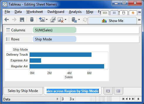
Instead of moving the cursor to the beginning of the previous—Ctrl+Left, or next—Ctrl+Right, word in the Sheet's name, Tableau narrows or widens the viz's cells.

What I expect.

In this image I'm trying to edit the Worksheet's name.

I've just double-clicked on the name tab and Tableau's shifted into sheet name editing mode (my term).

At this point I'd like to be able to Ctrl+Left a number times so I can put the cursor at the start of "across".

This is how it works in v8.0, and every earlier version of Tableau I can remember.

What Tableau does.

As this image, captured immediately after typing Ctrl+Left, shows, Tableau narrows the cells instead of moving the cursor in the editable Sheet name.

This cell adjusting behavior is perfectly fine and good, in its place, but shouldn't happen when one's editing a Sheet name. Or when editing any text. Or even in any other context where Ctrl+[Left|Right] has different semantics.

Why this matters.

I duplicate Sheets a lot. When I found this I was creating a dozen clones of a seed Worksheet that I'm preparing for my mapping of Tableau's Table Calculations.

Since these clones are variations on one another, each presenting the same Table Calc fields, varying only in their "Compute using" configuring, I name them accordingly. This means there's a lot of editing the middle words in the Sheet's names.

With Tableau 8.1 mis-interpreting the while-editing Ctrl+[Left|Right] functional semantics, this process is much more laborious than it should be.

Even worse, because my editing muscle memory is wired to use Ctrl+[Left|Right] to jump to the previous/next word start, I've been consistently changing the cell sizes, only to have to reset them to their original dimensions in addition to edit the Sheets' names by crawling the cursor through them character by character. (too wordy? too much noise? that's how I felt editing the names)

(I intend to publish a map, poster size, maybe larger, that lays out how Table Calcs interact with the viz structure, but that's not the point of this post)

Friday, November 29, 2013

Tableau Server 8 Certification Achieved

I'm very happy to have had the opportunity to take Tableau's certification exam for Tableau Server 8, and even happier to have passed it.

It's now my privilege to be able to use the Tableau Server 8 Certified logo, so here it is:

The exam is a good one. It's tough, long, comprehensive, and really exercises one's technical knowledge and ability to think about how Tableau Server works. It's long, at six hours, which is enough to cause a fair bit of anticipatory stress, and it's worth taking the full time allotment.

I want to extend my thanks to everyone I had the pleasure of working with in achieving this: Rebecca Nelson, John Cicero, Sarah Pierre-Louis, and Courtney Jacobsen. I was made welcome and comfortable, and really enjoyed meeting all of you.

Saturday, November 16, 2013

Tableau Server Performance Synopsis

This post simply compiles the high(ish) topics in the Tableau Server performance online help into a single place. This makes it easier to get a coherent overview of the range of considerations involved that by paging back and forth through a bunch of web pages. Or in the downloadable Server admin PDF.

The top level topics are links to their original source help pages, as are some of the subtopics.

General Performance Guidelines

Hardware and Software

Use a 64-bit operating system

Add more cores and memory

Configuration

Schedule refreshes for off-peak hours

Look at caching

Consider changing two session memory settings

VizQL session timeout limit

VizQL clear session

Assess your process configuration

When to Add Workers & Reconfigure

More than 100 concurrent users

Extracts

Heavy use of extracts

Frequent extract refreshes

Troubleshooting performance

Downtime potential

Improve Server Performance

What’s your goal?

Optimizing for Extracts

Optimizing for Users and Viewing

How Many Processes to Run

VizQL Server Process

Minimum number per deployment:

Maximum number per machine

Background Process

Data Engine and Repository Processes

Where to Configure Processes

Optimizing the Extracts and Workbooks

Assessing View Responsiveness

Examples

One-Machine Example: Extracts

Two-Machine Example: Extracts

Two-Machine Example: Viewing

Three-Machine Example: Extracts & Viewing

About Client-Side Rendering

The Tableau Server Processes

application server

VizQL Server

data server

repository

data engine

background

Create a Performance Recording

Use performance workbooks to analyze and troubleshoot performance issues pertaining to different events that are known to affect performance, including:

Query execution

Geocoding

Connections to data sources

Layout computations

Extract generation

Blending data

Server blending (Tableau Server only)

Create a Performance Recording in Tableau Server

Interpret a Performance Recording

Timeline

Events

Computing layouts.

Connecting to data source.

Executing query.

Generating extract.

Geocoding.

Blending data.

Server rendering.

You can speed up server rendering by running additional VizQL Server processes on additional machines.

Query.