
This post describes a Tableau hack that lets one present the labels in a bar chart horizontally aligned at the chart's right side.
Why call it a 'hack', not 'tip', 'trick', or 'technique'? Largely because the number of things involved, and the depth one needs to dig into Tableau in order to accomplish this have crossed the threshold from relatively straightforward into real complexity. And 'hack' is an time-honored term for getting some thing to do something it wasn't initially designed to do.
Background
In this Tableau Community post Chaitanya K asked if Tableau can emulate Excel's right-aligned value labels on bars in a chart, as in this image:

Here's Tableau's default presentation of the same data in a labeled bar chart.
Each bar's label is the bar's quantity and is set past the bar's end. The chart's dimensioning is adjusted to accommodate the additional space required for the labels—since the physical width of the chart remains the same the axis is compressed to make room for the labels.
This is perfectly acceptable unless it's not what you want.

Ramon Martinez provided a solution, manually moving Tableau's labels to the right by click-dragging them over.
This works well. The labels overlay the bars since the chart doesn't make room for them.
Drawbacks to this approach are: the labels are now in a fixed position so if the chart changes the labels will be out of place; it's difficult to manually jiggle the labels into precise positions; and the labels don't adjust their color to contrast their background, as Tableau's automatically presented labels do.

Jonathan Drummey provided another solution that takes advantage of Tableau's inner workings. A slightly revised version of Jonathan's solution is shown at right.
How it works: a calculated field is used in a dual axis chart to provide two functions:
- carry the individual bar's values and make them visible; and
- horizontally position the bars' labels at the chart's right side.
The primary benefit of this approach is that the labels are automatically aligned, and their placement adjusts to the actual data so that they're presented well no matter the bars' values.

Recreating Jonathan's Hack.
Here's Tableau Desktop showing the dissected worksheet showing all the elements of the right-aligned label presentation. See below for the detailed descriptions of worksheet's parts, how create this, and then configure it so that it's the final product.

The Annotated Worksheet – the relevant bits.
Confusing? Don't panic. Everything will be clear soon.
As can be seen in the dissected worksheet there are a lot of parts that need to be in place and properly configured in order for this hack to work.
The Parts – brief notes:
LL's 'real' name contains the Tableau Tableau Calculation used to provide its value, i.e.:
WIMDOW_MAX(SUM([value]))

Hacking the Worksheet.
All the parts enumerated above work together and it's difficult to untangle them, so I'll introduce them in the order of appearance in the process of transforming the standard Tableau bar chart into its right-aligned form.
I hope that this serves both as a cookbook for the hack, and to illuminate those Tableau operational characteristics that let this work so that you'll be able to leverage them in your future Tableau endeavors.
Note: we're going to overbuild the workseet at first—add some things that we'll back out later on. I'm doing it this way to make it easier to see what the individual parts are doing; it would be simpler to just go straight to the finished product but the principles underlying why things work the way they do wouldn't be as clear.
To recap, here's Tableau's default presentation the labeled bar chart.
Step 1. create the Calculated Field.
-
LL's Formula is: "
WINDOW_MAX(SUM([value])) +50" -
WINDOW_MAX(SUM([value]))
will always evaluate to the same value in this formulation,i.e. when the window is the entire chart. This ensures a constant value for each row in the chart, which we in turn will use to place the field's marks in the same horizontal position, i.e. along the horizontal axis. - Adding 50 to the value ensures that the field's marks will extend past the bar ends, assuming that the LL axis is scaled appropriately, which we will ensure later by syunchronizing the axes.
- The message "Results are computed along Table (Across)" is Created by Tableau, showing its default scoping for the calculation, in this case the entire table.

About the process.
From this point forward there are many different ways to get things organized into their right configurations. It really doesn't matter what path you take as long as you end up at the right configuration: with a dual axis chart; the primary measure is 'value'; the secondary is 'LL', calculated as above; the axes are synchronized; LL's header is hidden; LL's label is set to show only "sum([value)"; and LL's marks are made invisible.
When all these conditions are in place the chart's labels will be right aligned.
One of the tricky aspects of Tableau is that sometimes the path you take does matter. For example, if you hide LL's header before you synchronize the axes it isn't obvious how you go about doing so—the secondary axis is hidden and the only way to synchronize it is to unhide the header it's contained in first. Clear?
The following steps are one sequence that works. Follow them, or blaze you own trail if you're feeling adventurous. In the interest of trying to keep this post to a reasonable length I've combined seperate Tableau steps into single images where it seems to not cause too much confusion.
Step 2. set up the dual axis chart.
-
Drag LL from Measures to the right of SUM(value) on the Columns shelf.
Tableau will create a second set of bars on the chart for the LL values—these will all be the same size, although if Tableau isn't full screen you might not see their full size, as in the image.
Tableau will also place both measure names at the bottom of the Marks card, and the Marks card's "All" will be selected, indicated by being bolded. -
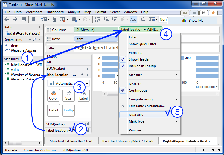
Click on LL's selector in the Marks card (remember, LL's real name starts with "label location", or whatever else you may have named it)
Tableau will make LL the selected field on the Marks card, bolding it.
Tableau will also move both fields to the above the button section in the Marks card. (this behavior is cute but it really does make documenting this stuff harder) -
Select "Automatic" for LL's marks type.
This doesn't have a visual effect, yet. - Access LL's contect menu via the little down-triangle glyph in LL's Columns pill, as shown. Note that the glyoh normally shows as an up-triangle showing that it's a calculated field and only changes to the down-triangle when you mouse over it.
-
Select "Dual Axis" from LL's context menu.
Tableau will check "Dual Axis" to show it's in effect and then hide the menu. -
Set "value's" mark type to bar – not shown in the diagram.
Select "SUM(value)" in the Marks card, then choose bar from the pulldown shown as 3.
Your worksheet now looks like this.
Both axes are showing, with different scales.
LL's marks are showing as circles labeled with LL's value of 350, as calculated.
The bars' labels are still showing.
This is excellent, we're well on our way.

Step 3. switch off value's labels.
This is a simple step, there's not much configuring to do with "value".
- Click on "SUM(value)" in the Marks card.
- Click on the "Label" buton.
- Toggle "Show mark labels" off.
In this image, value's labels have already been switched off.

Step 4. synchronize the axes.
This is pretty straightforward.
- Right-click on LL's axis (actually, pretty much anywhere in the header)
Tableau will show the context menu. - Toggle "Synchronize Axis" on.
The image shows "Synchronize Axis" already on and the axes synchronized.
It's easy to see LL's marks and labels clearly since they're positioned beyond the bars' ends due to the "+50" added to LL's calculated value.

Step 5. configure LL's labels.
-
Click on LL's selector in the Marks card (remember, LL's real name starts with "label location", or whatever else you may have named it)
Tableau will make LL the selected field on the Marks card, bolding it. -
Drag "value" from Measures to the Marks Card Label button;
Tableau adds "SUM(value)" decorated with the "Abc/123" glyph to the bottom of the Marks card to show it's been made available for label use.
Tableau replaces "LL's" values in the labels with "value's" values.

Step 6. make LL's marks invisible.
There are two actions to take here: making LL's marks as small as possible, and making them completely transparent. The combination of these renders them effectively invisible, even if they're not actually removed from the chart.
It doesn't really matter which you do first. I've shrunken the marks first, and the image shows them as mere dots.
-
If it's not already selected, click on LL's selector in the Marks card (remember, LL's real name starts with "label location", or whatever else you may have named it)
Tableau will make LL the selected field on the Marks card, bolding it. -
Shrink the marks by clicking on the Size button and then moving the slider all the way to the left.
Tableau will shrink the marks to their minimum size—the dots seen here. -
Make the marks transparent by
- clicking on the Color button and then moving the "Transparency" slider all the way to the left; and
- setting the marks' border to "None" by choosing it from the Border pulldown menu as shown.

Step 7. hide LL's header.
Hiding LL's header will remove its last visible trace.
Unhide the header by unchecking the "Show Header" option in LL's contect menu, as shown below.

Congratulations
Here's your brand new right-aligned bar chart.
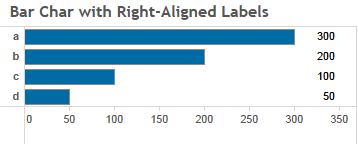
you're thinking: "that's a nice chart, but it's somehow not quite what I'm after"
Clearly, as nice as it is, the chart could use some fine tuning. The axis shouldn't go that far past 300 and there's too much white space before and after the labels.
Fine tuning the chart.
The good news is that fine tuning the chart isn't difficult. But since this post has become much longer than I planned, there are a couple of options: wait for my next post on this&mdash:Fine Tuning Right-Aligned Bar Charts"; or dig in and try some tuning on your own. The basics of tuning are pretty simple.
A main tuning element is LL's label alignment, primarily its horizontal alignment. This determines whether or not Tableau places the label to the left, center, or right of the mark. Since the mark here is essentially an invisible point some experimenting will show what affects the settings have.
Another main tuning element is the padding value provided to LL's calue in its calculation formula. This determines the marks' position on the horizontal axis. Changing this value will change the gap distance between the bars' ends and their labels, and they may even overlap.
The third major factor is value's axis configuration. The major options are "Automatic" and "Fixed". Try changing between these, and changing the Start and End values when fixed, to see what happens.
As always, please let me know if you find this interesting or helpful.
or, you could just move the pill for Sum(value) off the Columns shelf and onto the Size shelf with the Bar mark type and turn Labels on.
ReplyDeleteThanks Joe. I did that and it came out like the original excel request, with just a bit of overlap of the label and bar, but it only took a minute, so well worth that slight formatting trade-off.
ReplyDeleteIf you then Format the pill for Sum(value) to left-aligned, they values will show up left-aligned within the bars, and depending on their color, will be white or a middle gray. Fun times! Not exactly what was requested, but quick and readable!
ReplyDelete