Saturday, November 16, 2013

Resolving Tableau Server Permissions

Do you find puzzling out Tableau Server permissions confusing and mysterious? You're not alone.

I put this post together to help me figure out the process of how Tableau Server determines a User's permissions for a particular Workbook, Dashboard, or Worksheet. To my mind, the Tableau documentation is a bit twisty and hard to trace. It also doesn't surface the critical part that it's not always the view's permissions that are used, but those of the view's Workbook.

It's a work in progress. I plan on improving it as I work through the factors, interactions, dependencies, etc.

Factors affecting Permissions

License Level
see reference: Tableau Server Admin guide online

Unlicensed
users cannot connect per the TS doc
? should it therefore be impossible to assign permissions to an unlicensed user?
Viewers
cannot be assigned permissions other than 'View', 'Add Comments', and 'View comments'
Interactors
can be assigned any permissions
Guests
'users without an account on the server see and interact with an embedded view. When enabled, the user can load a webpage containing an embedded visualization without logging in. This option is only available with a core-based server.'
from the TS Admin Guide | About Enable Guest & Enable Automatic Login: "Enable Guest is a setting on the Maintenance page that can be selected if you have a core-based server license... users click a link and they go directly to the view with no login... no authentication is performed. The Tableau Server Guest User account is used to access the server, but as long as Enable Guest is selected, anyone can use it. Administrators often limit the capabilities of the Guest User account. For example, they might edit the permissions of certain views so that Guest User is denied access.

User Rights
see reference: Tableau Server Admin guide online

There are two distinct but inter-related 'things' Tableau lumps together as User Rights.

Publish
if designated as a Publisher, the user can: "connect to Tableau Server from Tableau Desktop in order to publish and download workbooks and data sources."

There are two configuration options for Publish:

Allow
provides the User the ability noted above, although the online doc doesn't explicitly enumerate this.
NOTE: as of TSv8.1b7 it's possible to assign "Allow" for an unlicensed Site user.
AND: this unlicensed user with Publish rights CAN successfully publish to Tableau Server.
Deny
similarly, although not explicitly in the doc, presumably when Publish is denied the User cannot publish or download Workbooks and Data Sources.
? If Publish is set to 'Deny', can the User be assigned any of the download permissions on individual objects, and if so, what would be the result?

Admin
Prerequisites in order for a user to be an admin s/he must be an Interactor with Publish granted.

Site Admin
"Can manage groups, projects, workbooks, and data connections. By default, site administrators can also add users and assign user rights and license levels but a system administrator can disable that (see Editing Sites)"
Server Admin
"all the rights of a site administrator, plus they can license unlicensed users, control whether site administrators can add users, create additional system administrators, and they can administer the server itself. This includes handling maintenance, settings, schedules, and the search index"
None
the user is not an admin.

There is an interesting asymmetry in the mechanisms of assigning User Rights. In my testing with Tableau Server v8.1 beta 7, when adding a new User I try to make it an Interactor and the Interactor license level isn't granted because the # of licensed users has been reached:

when checking the "Publish" User Right right, and that user subsequently becomes licensed as an Interactor the Publishing right is preserved;

however, when checking "Site Administrator", subsequently licensing the user as an Interactor doesn't preserve the "Site Adminstrator" in the same manner as was "Publish".

User Identity
see references in the Tableau Server Admin Guide (online):
Set Permissions for a Project
Set Permissions for Workbooks and Views
Set Permissions for a Data Source

Things get really conplicated with the introduction of User Identity. There are three distinct facets to a User's identity vis-a-vis Permissions:

The Individual
The User, identified by their User id. Permissions are always resolved to the User; how they get resolved is the question.
Roles
are bundles of permissions that can be associated with Users and Groups for specific Tableau Server assets (which begs the question: what's a Tableau Server asset?)
Groups
Users can have membership in zero, one, or more Groups. Asset Permissions may be individually associated to Groups, or Roles may associate bundles of Permissions.

One of the big complicating factors in determining whether a given permission is granted or denied to a particular User for a particular Tableau Server asset is the different relationships between the structural and permission-resolution relationships between Users, Roles, and Groups.

Users may belong to one or more Groups at the Site level.

Users and Groups may be associated with zero or one Role for a particular asset.

When Tableau Server determines individual Permissions' status for a user for a particular asset it assesses, in order, the Permissions' status for:
— the User;
— any Role the User is associated with for that asset;
— the permission status for that asset for any Groups to which the User belongs.

How Permissions Are Set – The Tableau Server Admin Guide Flowchart
redrawn for consistent Yes/No sequence and highlighting of Roles and Groups influence.

image/svg+xml UserDenied? Yes Denied No User inAllowed? Yes No User in Denied? Yes Denied No User in Allowed? Yes No Role Group Group Denied http://onlinehelp.tableausoftware.com/v8.0/server/en-us/help.htm#license_permissions_backgrnd.htm When resolving the permissions in place for a Dashboard or Worksheet (view), the object usedto evaluate the permissions is either the view or the Workbook the view is contained in. If the Workbook was published to show the its as tabs, the Workbook's permissions are used.If the Workbook was not published to show the its as tabs, the view's permissions are used. Yes No Was the Workbook published showing sheets as tabs? Workbook View Once the source of Permissions (Workbook or View) has been determined, this process resolves whether or not the User is granted the permission: Note: this chart does not represent the situation where a User has been explicitly grantedthe "Allow" permission. Source: use the use the the view is in

The permissions chart above is in SVG and was created using Inkscape.

Friday, November 15, 2013

Tableau Server Processes — Tableauing Tableau

Here's a Tableau Public workbook with a couple of dashboards presenting views of the Tableau Online help information about the Tableau Server processes.

I found that by listing the different performance characteristics and cross-referencing them to the processes I was able to get a new perspective on what the do, and in particular what their limitations and potential overload scenarios are. It's a big help to look down the list and see what might come up, and then see what process might be involved.

tabadmin set commands — Tableauing Tableau

The Tableau Public workbook below contains dashboards I put together to help me organize and interpret the various options available for the Tableau Server tabadmin set command.

Although the set command information is available in Tableau's online help here it's in a static HTML table, and I find it a lot more useful to have it in data so I can use Tableau to organize, filter, and reshuffle it in various ways when building my mental map of how the options relate to one another.

You can use the dashboards from Tableau public or download the workbook. Or if you're interested in how I got the online help content into data I've put that information below.

Rendering the online help table as data.
Since the HTML table is no-frills you can simply copy and paste it into Tableau. This works perfectly well since there are no HTML tags inside the table's cells to confuse Tableau. But its wasn't quite what I was after.

There are links in the options' descriptions that the copy/paste into Tableau method doesn't capture. I thought it helpful to have these so I whipped up a little Ruby script to parse the HTML and extract everything into a CSV file. And since the Jet engine hasn't yet been replaced (but soon, soon) I split the descriptions into 250-character sections, and recombined them with a calculated field after extracting the data into a TDE.

Using the Ruby script has several dependencies:

  • it's a Ruby script so your machine must be able to run Ruby, and you must have permissions to do so (sometimes not so easy in a corporate environment);
  • it uses some non-standard Ruby gems (libraries) so these need to be installed on your system – this is usually very straightforward and a quick Google will show the way;
  • you really should be comfortable with this level of technical stuff – if you're not there's likely someone nearby who can help, or you can always contact me.


# TTC_TabadminHelpToDataTv8.rb - this Ruby script Copyright 2013, Christopher Gerrard require 'nokogiri' require 'open-uri' $recNum = 0 $Tv8HelpRoot = 'http://onlinehelp.tableausoftware.com/v8.0/server/en-us/' $CSVOptionsHeader = 'Category,Option,Default Value,Description1,Description2,Link1,Link1Label,Link2,Link2Label' $CSVOptionsFormat = "\"%s\",\"%s\",\"%s\",\"%s\",\"%s\",\"%s\",\"%s\",\"%s\",\"%s\"" def init $fOpts = File.open("TTC_tabadminSetOptionsTv8.csv", 'w') $fOpts.puts $CSVOptionsHeader unless $fOpts.nil? end def cleanTxt txt return txt.gsub(/\\n/,' ').gsub(/"/,'""').strip end def pullCmds helpFile doc = Nokogiri::XML(open(helpFile)) cmdTable = doc.xpath('.//contents/body/div/table/tbody') cmdTable.each do |t| cmdRows = t.xpath('.//tr') cmdRows.each do |r| tds = r.xpath('.//td') option = tds[0].text.gsub(/\\n/,' ').strip category = option.split('.')[0] default = tds[1].text.gsub(/\\n/,' ').strip desc = tds[2].text.gsub(/\\n/,' ').strip desc1 = desc[0..250] desc2 = desc[251..501] links = tds[2].xpath('.//a') link1 = if links[0].nil? then '' else $Tv8HelpRoot + links[0].xpath('./@href').text.gsub(/\\n/,' ').strip end link2 = if links[1].nil? then '' else $Tv8HelpRoot + links[1].xpath('./@href').text.gsub(/\\n/,' ').strip end l1l = if links[0].nil? then '' else links[0].text end l2l = if links[1].nil? then '' else links[1].text end $fOpts.puts $CSVOptionsFormat % [category,option, default, desc1, desc2, link1, l1l, link2, l2l] end end end init pullCmds 'tabadmin set options cleaned.xml' #NOTE: the Tableau online help page has been saved locally as an XML file and cleaned up a bit $fOpts.close unless $fOpts.nil?

What TTC_TabadminHelpToDataTv8.rb does.

  • It accesses each row in the table as a separate set command option.
  • The first column contains the option's name.
  • The second column contains the option's default value.
  • The third column contains the option's description, which may exceed 255 charcters and contains zero, one, or two links, so the description is processed thus:
    • the description is split into two parts, each stored as its own field;
    • the links, if any, are captured as both a URL and label;
  • The fields are written into the CSV file.

How to use TTC_TabadminHelpToDataTv8.rb

  • Prerequisites
    • Minimal technical skills.
    • Have Ruby installed and ready to run.
    • Have the Nokogiri Ruby gem installed—it's used in the XML parsing.
    • Have the open-uri Ruby gem installed.
    • Have TTC_TabadminHelpToDataTv8.rb in place—it doesn't matter where, or what name you use, as long as you know where it is.
      You can copy the code above and paste it into your favourite text editor.
  • Running TTC_TabadminHelpToDataTv8.rb
    • Open a command prompt.
      (you can run it otherwise, but this is simple and straightforward)
    • CD to the directory containing the XML file you captured the online help page into.
    • Run it: "[path to]\ruby    [path to]\TTC_TabadminHelpToDataTv8.rb"
  • Presto. You now have a CSV file containing the tabadmin set command options as data.

The usual caveats.

TTC_TabadminHelpToDataTv8.rb works fine for me. But I wrote it and prepared the XML file it parses.

I hope it works for you, but make no guarantees. If you do use it and make improvements I hope that you'll post them back here as comments so I can learn from them, and hopefully other people can benefit from them too.

Tuesday, November 5, 2013

Precision Inputs Required In Addition To Analog Controls

Here's a friction point that's pretty simple and straightforward on the surface, but whose reach and roots are surprisingly broad and deep.

General Principle
Whenever Tableau provides the ability to configure an element's property value it should provide a mechanism for the User to specify a precise value. The values the User can enter shall be subject to the domain requirements of the element being configured, i.e. of the appropriate type and limitations on value.

Specific Example – Viz Field Size
When configuring the Size for a field in the Marks card, the User should have the opportunity to enter a precise value in addition to being able to adjust the position of the Size control slider, which is the only current adjustable mechanism.

In the specific case of the Marks Card's Size control, Tableau only provides the horizontal slider, which isn't good for precisely specifying the size value. Contrast this with the Color Transparency configuration, which provides an numeric(%) input field along with a synchronized slider which enables a level of precision in specifying the Transparency value unavailable in the Size configuration.

This image shows the Color Transparency and Size configuration controls.

The inability of the User to precisely specify a numeric value for Size may not seem like a big deal—the slider lets you adjust the Size value simply and quickly. You may think to yourself: "This is not a big problem, why make a fuss?"

I'm glad you asked.

It's simple: small variations in Size, e.g. bar widths have significant impacts in cognition. It's a primary reason we visualize data using geometric properties.

Suppose you have multiple renderings of the same base chart in a dashboard. It's important for them to be as visually consistent as possible so that variations in the data are easy to spot. With Tableau's current design it's almost impossible to ensure precisely the same useful Size configuration across the worksheets unless it's either the minimum, middle, or maximum value. (the min and max are the end points, the middle has a 'detent' feature)

This situation arose when I was creating a dashboard for a very particular client; in working with them even tiny variances caused hesitation and a "That's not quite right." reaction. I ended up hacking the TWB to make sure that the individual size values were the same, but that's not a realistic solution for most people, nor should it be.

An Improved Design

This Size configuration design adopts the Color Transparency slider/input control combination. This provides the flexibility and specificity we're looking for.

There's the additional benefit of function/presentation similarity—having the same mechanism for configuring similar things eliminates the cognitive impedance imposed when the User needs to switch mental gears to adjust to different ways of doing the same thing. Since Color Transparencey and Size aren't simultaneously visible this is currently a subliminal discontinuity, which in some regards is more perplexing.

Input Constraints

Configuration inputs need constraints on the user-entered values to ensure that only legitimate values get applied. For example, it makes no sense to set the Size for a bar chart to "Guy Fawkes Day". Tableau Parameters implement a reasonable starting point for constraints. Examples of constraints include:

  • type, e.g.: numeric – integer, real, percentage, etc.; string; boolean; date & datetime
  • range, if applicable, including less then, greater than, from-to. not equal to, etc;
  • set of allowable values, either enumerated or data-dependent, including set membership, not in set; etc.
  • others (this isn't intended to be an exhaustive survey of constraint elements)

Existing configuration controls like the Size slider have the constraints built in—the User can't move the slider past either end so the Size value, and therefore the bars' width, cannot exceed the minimum or maximum values.

Example: Size configuration

The question is: "What should the Size value indicate, and what should its range be?"

As shown below, the minimum Size value corresponds to very narrow but visible bars and the maximum value correponds to bars whose width spans the full width of the row,

As shown above, the new Size input control is at maximum—100%. Whether sizing on a percentage scale is appropriate is a legitimate consideration, one that needs to take into account the full spectrum of potential Size configuration scenarios. But for now it seems reasonable that Size can be a percentage scale, with possibly a floor value of 1%—it's not clear whether or not the current

Current Size Range
This dashboard has three versions of the same chart, with the Size adjusted, in left-right order, to its leftmost (min), middle (mid), and rightmost (max) positions.

I've included the actual TWB Size values below the charts, as we see, the min value is slightly less than one percent, mid is precisely 1 and max is precisely 2.

About the min value: many of Tableau's internal values are odd in this high-precision fashion, which helps understand some oddities, but that's a topic for another post.

As we see here, the range of Size values is fairly limited, from slightly more than zero to two. It's not at all clear why Tableau chose this range, or whether it would be meaningful and useful to a User trying to configure Size—my initial feeling is that it wouldn't be.

A percentage range from 0-100%, or 1-100% seems like a good candidate Size range. It feels likely that a correspondence of zero to effectively an invisible point and/or one percent to one pixel (or whatever the size unit is) would provide a robust range, and the use of integers for the percentage values avoids the messiness associated with real numbers. It's also easy to accommodate values greater than 100%, although I'm not clear on whether this makes sense.

Extending Configuration Functionality

Parameterization

All configurable elements should be responsive to parameterized values which can be data fields, calculated fields, or Parameters. These values must conform to the appropriate element-specific constraints, .

In addition to its configuration benefits adding this functionality cracks opens the door to Tableau being able to analyze data it's currently unable to interpret and present. This data is variously called post-relational, non-tabular, NoSQL, etc. (I'm working on posts covering this.) It also brings in the longstanding discussions about the relationship between Parameters and data, particularly the community's desire for Parameter values to be dynamically populated by the current data.

An example of this extension's value is in Axis configuration, where there are two levels of configuration and multiple configuration values. In the first level are the configurations for Automatic, Fixed, Uniform, or Independent row and column axes. The second level configuration values are Start and End for Fixed range axes; providing for data-based Start and End values provides the opportunity to fine tune data-sensitive presentations that are impossible with the current fixed-value configuration.

Expanded Data Access

Configuration Files
It would be extremely helpful if Tableau could digest common forms of configuration data, e.g. XML, INI, JSON, and YAML. Consuming these would provide the ability to establish common sets of configuration values, which could among other benefits be the platform for uniform styling and branding.

Configuration files are notably different from the data files Tableau was designed to work with. One major difference is that the config files are (roughly) organized around a parameter per line/element structure while data files are collections of records, each with its own value for each of the enumerated fields.

Tableau already consumes at least XML and YAML files. TWBs are XML and Tableau Server uses YAML for configuration information, so it doesn't seem to be that big a technical reach to implement their use for configuration information.

Data Analysis Consequences
Starting with Tableau's use of different data structures for configuration information, it's a relatively straight path to accessing these new data sources for traditional Tableau analysis.

But although it's a straight path it's not simple and trivial. There are multiple challenges involved, with subtleties, complexities, and consequences that make providing the necessary general data modeling and mapping of complex data to Tableau's analytical semantics a real and interesting challenge.

Simultaneous Multi-Element Configuration

This will be a big step forward. Providing the ability to configure a property for multiple elements at the same time will be a tremendous boost to Tableau Users' productivity, and to a lesser degree output quality. For example, it will reduce and in many cases eliminate the drugery and error-prone tedium of switching back and forth between multple worksheets and dashboards to make sure that they're consistent.

But it's not a simple and easy change. Tableau's not set up for this operational mode, and there are deep and serious implications that reach to the core of the mechanisms necessary for presenting the configurable elements and in providing sensible means to configure them.

The good news is that the mechanisms, models, and functionalities required to implement this ability are those required to model, manage, and analyze complex non-tablular data, so there is a virtuous positive feedback loop between this feature and accessing complex data for configuration and traditional Tableau analysis.

Wednesday, October 30, 2013

Hack Anatomy: Right-Aligning Bar Chart Labels

This post describes a Tableau hack that lets one present the labels in a bar chart horizontally aligned at the chart's right side.

Why call it a 'hack', not 'tip', 'trick', or 'technique'? Largely because the number of things involved, and the depth one needs to dig into Tableau in order to accomplish this have crossed the threshold from relatively straightforward into real complexity. And 'hack' is an time-honored term for getting some thing to do something it wasn't initially designed to do.

Background

In this Tableau Community post Chaitanya K asked if Tableau can emulate Excel's right-aligned value labels on bars in a chart, as in this image:

Here's Tableau's default presentation of the same data in a labeled bar chart.

Each bar's label is the bar's quantity and is set past the bar's end. The chart's dimensioning is adjusted to accommodate the additional space required for the labels—since the physical width of the chart remains the same the axis is compressed to make room for the labels.

This is perfectly acceptable unless it's not what you want.

Ramon Martinez provided a solution, manually moving Tableau's labels to the right by click-dragging them over.

This works well. The labels overlay the bars since the chart doesn't make room for them.

Drawbacks to this approach are: the labels are now in a fixed position so if the chart changes the labels will be out of place; it's difficult to manually jiggle the labels into precise positions; and the labels don't adjust their color to contrast their background, as Tableau's automatically presented labels do.

Jonathan Drummey provided another solution that takes advantage of Tableau's inner workings. A slightly revised version of Jonathan's solution is shown at right.

How it works: a calculated field is used in a dual axis chart to provide two functions:

  • carry the individual bar's values and make them visible; and
  • horizontally position the bars' labels at the chart's right side.

The primary benefit of this approach is that the labels are automatically aligned, and their placement adjusts to the actual data so that they're presented well no matter the bars' values.

Recreating Jonathan's Hack.

Here's Tableau Desktop showing the dissected worksheet showing all the elements of the right-aligned label presentation. See below for the detailed descriptions of worksheet's parts, how create this, and then configure it so that it's the final product.

The Annotated Worksheet – the relevant bits.
Confusing? Don't panic. Everything will be clear soon.

As can be seen in the dissected worksheet there are a lot of parts that need to be in place and properly configured in order for this hack to work.

The Parts – brief notes:

Calculated Field
is the heart of the hack, which takes advantage of Tableau's ability to arrange its presentation to accommodate the data being shown.
LL's 'real' name contains the Tableau Tableau Calculation used to provide its value, i.e.:
WIMDOW_MAX(SUM([value]))
LL axis
is the secondary axis in the dual axis chart. Placement of the LL marks along this axis is how the labels get right-aligned. It needs to be synchronized with the value axis, and will be hidden when the LL header is hidden.
LL header
Will be hidden in the final dashboard, hiding the hack's mechanisms behind the curtain.
value axis
the final chart's axis, it can be configured to achieve different alignment effects—these will be covered in a separate section.
bar labels
are the labels Tableau provides by default. Sonce we're providing our own labels, these need to be turned off. If Tableau could right-align these labels along the right side of the chart we wouldn't need this hack.
LL presentation
is the combination of the mark (the circle) and the label (here with two numbers) for each value of LL in the chart. As seen here, there are four LL presentations, one for each bar.
LL marks
are circles, one for each value of LL in the chart. This hack works because Tableau anchors things to marks so these need to be here, the real trick is to make them tiny and invisible.
LL labels
show two values. The first is the bar's quantity value–we want to keep and right-align this. The second is the LL value for this mark; note that all four LL values are the same by design—this is what makes this hack work, and we don't want this to show.

Hacking the Worksheet.

All the parts enumerated above work together and it's difficult to untangle them, so I'll introduce them in the order of appearance in the process of transforming the standard Tableau bar chart into its right-aligned form.

I hope that this serves both as a cookbook for the hack, and to illuminate those Tableau operational characteristics that let this work so that you'll be able to leverage them in your future Tableau endeavors.

Note: we're going to overbuild the workseet at first—add some things that we'll back out later on. I'm doing it this way to make it easier to see what the individual parts are doing; it would be simpler to just go straight to the finished product but the principles underlying why things work the way they do wouldn't be as clear.

To recap, here's Tableau's default presentation the labeled bar chart.

Step 1. create the Calculated Field.

  • LL's Formula is: "WINDOW_MAX(SUM([value])) +50"
  • WINDOW_MAX(SUM([value]))
    will always evaluate to the same value in this formulation,i.e. when the window is the entire chart. This ensures a constant value for each row in the chart, which we in turn will use to place the field's marks in the same horizontal position, i.e. along the horizontal axis.
  • Adding 50 to the value ensures that the field's marks will extend past the bar ends, assuming that the LL axis is scaled appropriately, which we will ensure later by syunchronizing the axes.
  • The message "Results are computed along Table (Across)" is Created by Tableau, showing its default scoping for the calculation, in this case the entire table.

About the process.

From this point forward there are many different ways to get things organized into their right configurations. It really doesn't matter what path you take as long as you end up at the right configuration: with a dual axis chart; the primary measure is 'value'; the secondary is 'LL', calculated as above; the axes are synchronized; LL's header is hidden; LL's label is set to show only "sum([value)"; and LL's marks are made invisible.

When all these conditions are in place the chart's labels will be right aligned.

One of the tricky aspects of Tableau is that sometimes the path you take does matter. For example, if you hide LL's header before you synchronize the axes it isn't obvious how you go about doing so—the secondary axis is hidden and the only way to synchronize it is to unhide the header it's contained in first. Clear?

The following steps are one sequence that works. Follow them, or blaze you own trail if you're feeling adventurous. In the interest of trying to keep this post to a reasonable length I've combined seperate Tableau steps into single images where it seems to not cause too much confusion.

Step 2. set up the dual axis chart.

  1. Drag LL from Measures to the right of SUM(value) on the Columns shelf.
    Tableau will create a second set of bars on the chart for the LL values—these will all be the same size, although if Tableau isn't full screen you might not see their full size, as in the image.
    Tableau will also place both measure names at the bottom of the Marks card, and the Marks card's "All" will be selected, indicated by being bolded.
  2. Click on LL's selector in the Marks card (remember, LL's real name starts with "label location", or whatever else you may have named it)
    Tableau will make LL the selected field on the Marks card, bolding it.
    Tableau will also move both fields to the above the button section in the Marks card. (this behavior is cute but it really does make documenting this stuff harder)
  3. Select "Automatic" for LL's marks type.
    This doesn't have a visual effect, yet.
  4. Access LL's contect menu via the little down-triangle glyph in LL's Columns pill, as shown. Note that the glyoh normally shows as an up-triangle showing that it's a calculated field and only changes to the down-triangle when you mouse over it.
  5. Select "Dual Axis" from LL's context menu.
    Tableau will check "Dual Axis" to show it's in effect and then hide the menu.
  6. Set "value's" mark type to bar – not shown in the diagram.
    Select "SUM(value)" in the Marks card, then choose bar from the pulldown shown as 3.
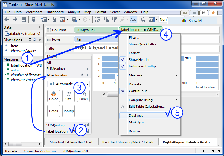
Your worksheet now looks like this.

Both axes are showing, with different scales.

LL's marks are showing as circles labeled with LL's value of 350, as calculated.

The bars' labels are still showing.

This is excellent, we're well on our way.

Step 3. switch off value's labels.

This is a simple step, there's not much configuring to do with "value".

  1. Click on "SUM(value)" in the Marks card.
  2. Click on the "Label" buton.
  3. Toggle "Show mark labels" off.

In this image, value's labels have already been switched off.

Step 4. synchronize the axes.

This is pretty straightforward.

  1. Right-click on LL's axis (actually, pretty much anywhere in the header)
    Tableau will show the context menu.
  2. Toggle "Synchronize Axis" on.

The image shows "Synchronize Axis" already on and the axes synchronized.

It's easy to see LL's marks and labels clearly since they're positioned beyond the bars' ends due to the "+50" added to LL's calculated value.

Step 5. configure LL's labels.

  1. Click on LL's selector in the Marks card (remember, LL's real name starts with "label location", or whatever else you may have named it)
    Tableau will make LL the selected field on the Marks card, bolding it.
  2. Drag "value" from Measures to the Marks Card Label button;
    Tableau adds "SUM(value)" decorated with the "Abc/123" glyph to the bottom of the Marks card to show it's been made available for label use.
    Tableau replaces "LL's" values in the labels with "value's" values.

Step 6. make LL's marks invisible.

There are two actions to take here: making LL's marks as small as possible, and making them completely transparent. The combination of these renders them effectively invisible, even if they're not actually removed from the chart.

It doesn't really matter which you do first. I've shrunken the marks first, and the image shows them as mere dots.

  1. If it's not already selected, click on LL's selector in the Marks card (remember, LL's real name starts with "label location", or whatever else you may have named it)
    Tableau will make LL the selected field on the Marks card, bolding it.
  2. Shrink the marks by clicking on the Size button and then moving the slider all the way to the left.
    Tableau will shrink the marks to their minimum size—the dots seen here.
  3. Make the marks transparent by
    1. clicking on the Color button and then moving the "Transparency" slider all the way to the left; and
    2. setting the marks' border to "None" by choosing it from the Border pulldown menu as shown.
    Tableau will make the marks fully transparent, and they will disappear.

Step 7. hide LL's header.

Hiding LL's header will remove its last visible trace.

Unhide the header by unchecking the "Show Header" option in LL's contect menu, as shown below.

Congratulations

Here's your brand new right-aligned bar chart.
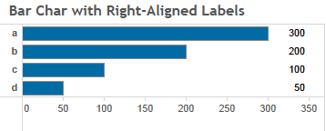

but...

you're thinking: "that's a nice chart, but it's somehow not quite what I'm after"

Clearly, as nice as it is, the chart could use some fine tuning. The axis shouldn't go that far past 300 and there's too much white space before and after the labels.

Fine tuning the chart.

The good news is that fine tuning the chart isn't difficult. But since this post has become much longer than I planned, there are a couple of options: wait for my next post on this&mdash:Fine Tuning Right-Aligned Bar Charts"; or dig in and try some tuning on your own. The basics of tuning are pretty simple.

A main tuning element is LL's label alignment, primarily its horizontal alignment. This determines whether or not Tableau places the label to the left, center, or right of the mark. Since the mark here is essentially an invisible point some experimenting will show what affects the settings have.

Another main tuning element is the padding value provided to LL's calue in its calculation formula. This determines the marks' position on the horizontal axis. Changing this value will change the gap distance between the bars' ends and their labels, and they may even overlap.

The third major factor is value's axis configuration. The major options are "Automatic" and "Fixed". Try changing between these, and changing the Start and End values when fixed, to see what happens.

As always, please let me know if you find this interesting or helpful.

Friday, October 25, 2013

A Small Matter of Labels

Sometimes the little things grab our notice.

In this case, here's a standard Tableau bar graph, and we'd like to have it show the bar's values as labels.

Tableau makes this simple and straightforward. See below for the main methods for doing so.

This composite image illustrates how to show the bars' labels (remembering that the bars are 'marks'), i.e.:

  1. the Analysis menu's
    "Show Mark Labels" option; and
  2. the Marks card's Label button's
    "Show mark labels" toggle.

In this case, here's a standard Tableau bar graph, and we'd like to have it show the bar's values as labels.

Tableau makes this simple and straightforward. See below for the main methods for doing so.

Where's the Friction?

It's really pretty simple, the labels for the options used to show/hide the marks' labels aren't the same:

Show Mark Labels
Show mark labels

Spot the difference?

It's somewhat picky to focus on the difference in capitalization, but some friction points are smaller than others, and they all add up.

It's also worth noting that the other options in the Marks card's Label button are all proper cased, matching the Analysis menu options.

Thursday, October 24, 2013

Tv8.1 Beta 3 Worksheet, Dashboard menus improved, still room for more

This post continues my previous post on these Tv8 menus. Please refer to it for background, this one only contemplates improvements yet to be made.

Functional Problems, Bugs

  • Dashboard right-click menu:
    • "Duplicate as Crosstab"
      does not work - active when a Worksheet is selected in Dashboard, choosing this option has no effect—the expected duplication of the selected Worksheet does not happen.
    • "Copy Formatting"
      does not work - cannot find any scenario in which the option is active.
    • "Paste Formatting"
      does not work - cannot find any scenario in which the option is active.

Top Level Menus

The Worksheet and Dashboard menus:

Residual problems include:

  • The items are organized differently, which causes unnecessary difficulty in locating them. The crossed lines indicate the different positions of "Actions..." and "Show Title". Not only are they in different orders, they're found in different compartments.
  • There's no "Format" option in the Worksheet menu, although the Dashboard menu has one. IT seems like there's no good reason for one to have this option and not the other.

Corrections:

These menus have been adjusted to align and coordinate their items, making the mechanics of selecting an option similar across the menus.

The Worksheet menu's Format option.

This Worksheet menu's Format option is shown with the 'more' glyph indicating that there is a submenu available. In this formulation the submenu could well be the same as the top level Format menu. Another option would be to simply launch the Format system in the "format a worksheet mode". This leads naturally into the consideration that Tableau's property sheet formatting mechanisms are dated and need a redesign, but that's another topic.

Right-Click Context Menus – now it gets interesting.

The Worksheet and Dashboard Right-Click context menus:

Interestingly, the menus have the same options. There are plenty of things that can be fixed here, including:

  • "<verb> Sheet" - the use of the generic "Sheet" creates a cognitive dissonance.
    The user has right-clicked on either a Worksheet tab or a Dashboard tab. Tableau knows which one it is, but chooses to not specifically identify it. Why not? Is "Sheet" something special, distinct from "Worksheet" or "Dashboard"? It's this sort of context slippage that introduces confusion.
  • The options are the same, even though they are not targeted the same in the different menus.
    The Worksheet options all relate to the Worksheet, but the Dashboard options don't all apply to the Dashboard, i.e.
    "Duplicate as Crosstab" applies to whichever Worksheet is active, if one is; if not it's inactive.
  • The Dashboard menu Formatting options do not appear to have any function. In my limited testing I haven't been able to find any way to have them active.

  • It's not at all clear what the "Color" option does.
    (actually, it just provides the opportunity to color the tab)

It looks like the Dashboard menu is a straight copy of the Worksheet menu, with some of the options re-targeted to the Dashboard. This is a bad design, muddling up the options for managing the configuration options available for the Worksheet or Dashboard of interest. The Worksheet menu is relatively straightforward, within the current context, but the Dashboard menu is a mess.

Right-Click Context Menus – Redesigned.

The main idea behind these redesigns is to clarify and regularize the management options appropriate for whichever type of sheet is chosen. As noted above, the current menu structures are the same for both, even though the legitimate management options differ. Notably, there are two distinct modes for a Dashboard: whether or not a Worksheet is currently selected in it.

As Tableau's functional span has dramatically increased since the initial management by menu architecture was implemented it would be useful to reconsider how to best offer the appropriate mechanisms for managing its components and content. I'll leave this for future posts. This post is restricted to considering only these two modes, disregarding whether it would be useful and/or appropriate to include other Dashboard object management options via this menu.

Worksheet Menu – New and Improved

There's not a lot changed here. The options remain the same, with some changes made to their presentation.

  • The "Worksheet" item was added to call out that these are Worksheet options, and the options were indented; this is unnecessary in the context of this one menu, but it's done to be consistent with the new Dashboard menu (below).
  • The "Color" option was renamed "Color Tab" to clarify what was being colored. "Color" is pretty confusing all by itself, leading naturally to the question: "Color what?", at which point the user was left to try give it a go and see what happened, and if they selected a color not noticeably different from the current color they might well not identify what happened.

Dashboard Menu – New and Improved #1

The main objective here is to update the Dashboard menu to better present those things that can be done with and to the Dashboard and/or Worksheet.

The challenge is to come up with a way to clearly identify which object an option acts on.

The biggest difference between this menu and the existing one is that the new design clearly segregates the Dashboard and Worksheet options into their own menu segments. Doing this makes it clear which option applies to which object.

On top of moving the options into their own segments, the Worksheet options are only active when a Worksheet is selected in the Dashboard. The left menu shows the Worksheet-selected active Worksheet options, the right menu shows inactive Worksheet options.

Although useful, this approach takes up a lot of space, imposing its own usability burden. One solution to this problem is below.

Dashboard Menu – New and Improved #2

In this model the Worksheet segment has been collapsed because there's no currently selected Worksheet in the Dashboard.

The "Worksheet" item has also been greyed out as a visual cue that there is no active Worksheet.

This design works fairly well, although there is a bit of a jar in the conditional appearance of the Worksheet segment. The design below looks to address this.

Dashboard Menu – New and Improved #3

In this version the Worksheet options have been moved into their own submenu.

The Worksheet menu item and options are activated when a Worksheet is selected in the Dashboard, inactive when there's not one selected.

This works well in terms of consistency of presentation. Everything's in the same place all the time, and even when there's no Worksheet selected the user can see what options would be available to manage one if selected.

This is starting to look pretty good, but in considering it the question comes up: why not provide access to all of the legitimate Worksheet management options through this menu? What would that look like and how would it work? So I put it together below.

Dashboard Menu – New and Improved #4

In the version the Worksheet submenu has all of the options from the main Worksheet menu. It's not obvious whether or not this works well. It might overload the menu, confusing the user with all the options in two places. We're now into real user interface design and usability territory and investigating whether and how well this works would be a real valuable activity.

That's all, folks.